And they made a design system, delivered a style guide, and lived happily ever after. Right?
Not quite.
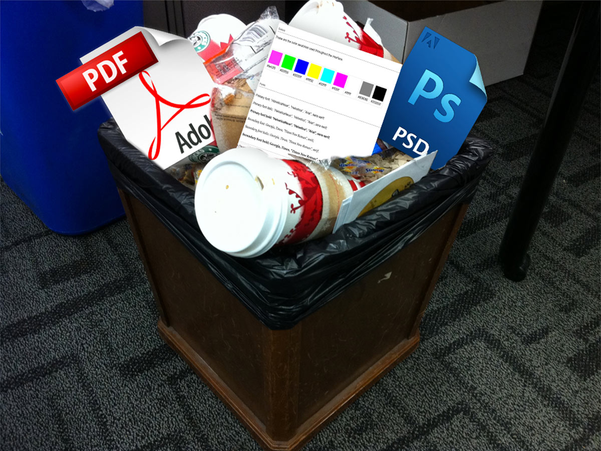
There’s a very real risk that a style guide will end up in the trash can right alongside all the PSDs, PDFs and those other static artifacts of the design process. Despite everyone’s best intentions, all the time and effort that went into making a thoughtful design system and style guide can go straight down the drain.
How can that be?
A style guide is an artifact of design process. A design system is a living, funded product with a roadmap & backlog, serving an ecosystem. Nathan Curtis
An artifact is something you’d find on an archaeological dig or in a museum, whereas a system is a living, breathing entity. A style guide can provide documentation and serve as a helpful resource, but the simple existence of a style guide doesn’t guarantee long-term success for the underlying design system. A design system needs ongoing maintenance, support, and tender loving care for it to truly thrive.
Changing minds, once again
We’ve already discussed the importance of resetting everyone’s expectations to establish a more collaborative, pattern-driven workflow. To save our style guides from the bowels of a trash can, we must once again fundamentally rewire people’s brains.
What is it we’re making again?
We think we merely design and build websites and apps. And that’s true for the most part. After all, that’s what our clients pay us to do, and the products we create are the vehicles that generate money and success for our organizations. It seems natural to focus on the final implementations rather than the underlying system. The live products remain the primary focus of everyone’s attention, while any pattern library exists as an offshoot that simply provides helpful documentation.
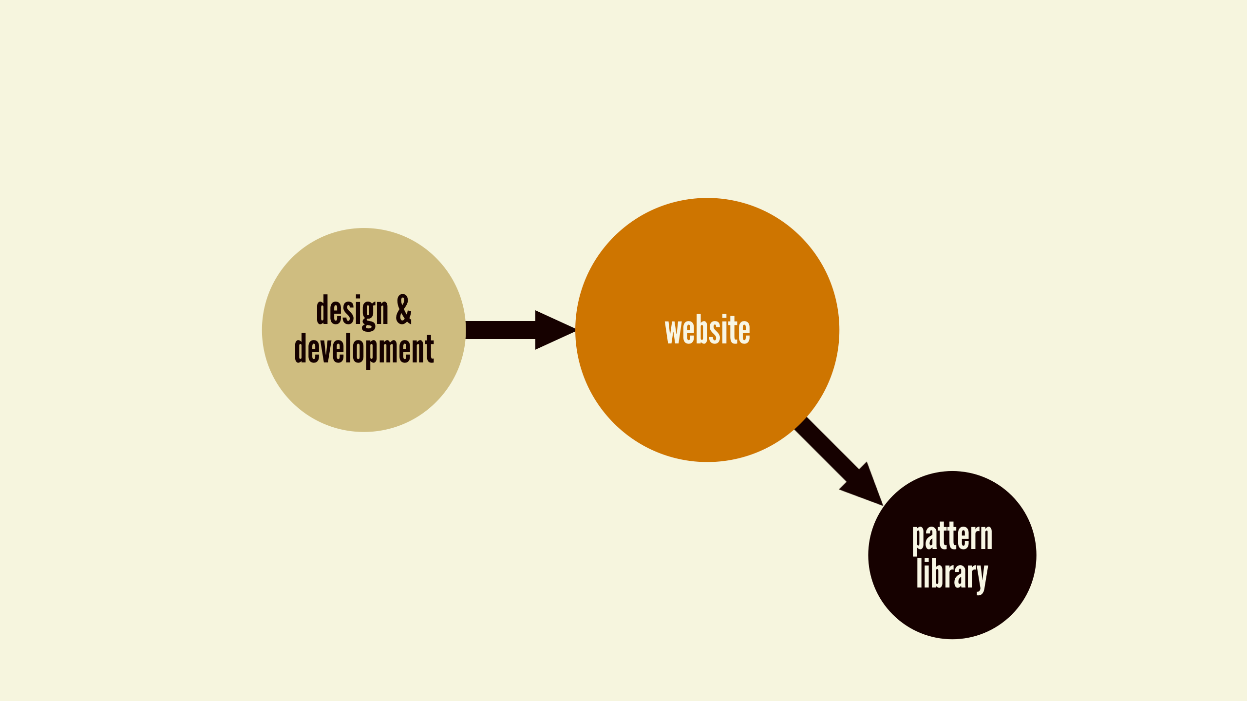
The problem with this mindset is that you can almost see that pattern library snapping off and sliding into the abyss. Once the pattern library ceases to reflect the current state of the products it serves, it becomes obsolete. And when the pattern library managing the design system is no longer accurate, the website maintenance process devolves into a smattering of hotfixes and ad hoc changes, ruining all the thoughtfulness that went into creating the original design system.
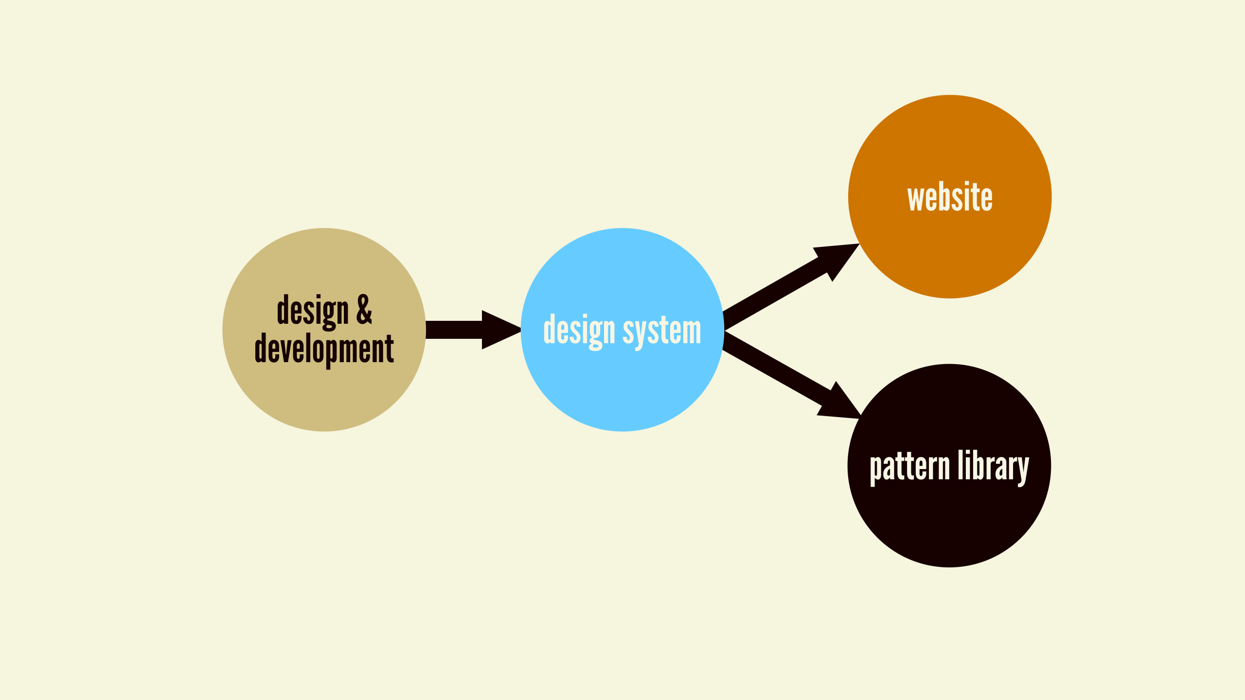
To set ourselves up for long-term success, we must fundamentally shift our outlook around what we’re actually creating. Rather than thinking of final applications as our sole responsibility, we must recognize that the design system is what underpins our final products and pattern libraries.
This “design system first” mentality inserts a bit of friction into the maintenance process, and that friction can be friendly. It forces us to step back and consider how any improvements, client requests, feature additions, and iterations affect the overall system rather than only a sliver of the whole ecosystem.
Say you’re working on an e-commerce site, and you run a test that finds a custom-styled dropdown menu on the product detail page isn’t performing as well as the browser’s default dropdown menu. One course of action is to simply remove the custom-styled dropdown from that particular page and call it a day. However, considering the entire design system rather than just the product detail page might cause you to take a step back and wonder, “If this custom dropdown menu isn’t performing well here, perhaps it’s not performing well elsewhere.” After digging into the issue further, you find the best course of action is to globally modify the dropdown pattern in the design system to remove the custom styling. Now, anywhere the dropdown pattern appears will reflect those changes and will likely see similar performance improvements.
That is just one example of how design-system thinking can lead to broader, more considered changes. Broken behavior and opportunities to enhance the UI will often be realized at the application level, but those changes should often be acted on at the system level. Adding this bit of friendly friction into your workflow ensures improvements are shared across the entire ecosystem, and prevents the system from being eroded by a series of one-off changes.
Done and done
Another expectation we must revisit is our definition of done. Creating things for print and other physical media involves making permanent, tangible objects. That sense of finality simply doesn’t exist in the digital world, which means change can happen with much less effort and friction than other media. Clients, colleagues, and stakeholders should embrace the pliable nature of the digital world to create living design systems that adapt to the ever-shifting nature of the medium, user needs, and the needs of the business.
This shift in thinking fundamentally affects the scope of our work. Folks working in the client services business are often used to delivering a project in a tidy package then riding off into the sunset. Internal teams don’t fair much better, since they tend to float from one initiative to the next. Whether you’re part of an internal team or you’re an external gun for hire, I’m guessing you’ve experienced the shortcomings of project-based work. We tend to talk about a future that never comes, and instead we set it, forget it, then move on to the next shiny project.
If we’re committed to creating genuinely useful work that truly meets the needs of our clients and organizations, we must fundamentally redefine the scope of our work. As Nathan Curtis says, a design system shouldn’t be a project with a finite scope, but rather a product meant to grow and evolve over time:
Focusing on style guide delivery as the climax is the wrong story to tell. A system isn’t a project with an end, it’s the origin story of a living and evolving product that’ll serve other products. Nathan Curtis
The web is never done, and the creation of a design system is merely the first step in a long (and hopefully fruitful!) journey. A design system should be a long-term commitment with the ambitious goal of revolutionizing how your organization creates digital work. Exciting, eh?! So how do we make sure that happens?
Creating maintainable design systems
As you embark on this pattern-paved journey, let’s talk about things you can do to craft a design system that sets up your organization for long-term success. How do you create a design system that takes root and becomes an essential part of your organization’s workflow? What pitfalls do you need to be on the lookout for? How do you ensure the design system yields big results? To set up your design system for long-term success, you need to:
- Make it official.
- Make it adaptable.
- Make it maintainable.
- Make it cross-disciplinary.
- Make it approachable.
- Make it visible.
- Make it bigger.
- Make it context-agnostic.
- Make it contextual.
- Make it last.
Let’s dive into each one of these points in a bit more detail.
Make it official
Your initial style guide may begin its life as a side project, the result of a weekend hackathon, or as the brainchild of one or two ambitious team members. As we discussed in the previous chapter, your client or boss doesn’t even have to know that you’re creating a thoughtful design system and accompanying pattern library. Remember: ask forgiveness, not permission!
Organic beginnings are all well and good, but in order to establish a truly impactful design system that creates long-term success for your organization, the design system needs to evolve into an officially sanctioned endeavor. That means thinking of it as a true product rather than a simple side project, and consequently allocating real time, budget, and people to it.
Convincing stakeholders to commit large chunks of money, time, and resources up front for a design system can be extremely challenging. So what are we to do? Here’s my advice:
- Make a thing.
- Show that it’s useful.
- Make it official.
Let’s break down these steps a bit further.
1: Make a thing
You have to start somewhere, and having something started is better than nothing at all. Pick a project that would be a great pilot for establishing your design system; follow a process similar to the one discussed in chapter 4; think about the atomic design mental model detailed in chapter 2; and you’ll end up with a solid foundation for a thoughtful design system and pattern library that helps your team work more effectively.
Take the time to package your UI patterns in a pattern library and get it ready to be shopped around. I’ve talked to several ambitious team members who have established the basic gist of their pattern library over the course of a weekend. This effort makes all the difference in the world since it provides something tangible for stakeholders to react to. Again: show, don’t tell.
2: Show that it’s useful
With a nascent-yet-tangible design system in place, you can have more meaningful conversations with the people who control money, scheduling, and resources. You can discuss exactly how the design system helped save time and money (see “Pitching Patterns” in chapter 4), then paint a picture of how those benefits would scale even further if the organization invested in an official, full-fledged design system.
Get team members from different disciplines to back you up and discuss the initial success of the system, and also pull in others who are sympathetic to the cause who would stand to benefit from an expanded design system.
3: Make it official
You’ve proved the value of your initial design system and presented a roadmap for how to make it even better. With any luck your organization will commit to making the design system an Official Thing.
With approval from the highest levels, you’re now able to put a plan into action that involves: allocating or hiring people to work on the design system; developing a plan to make it more robust; establishing a clear governance strategy; and laying out a product roadmap.
It’s worth pointing out that things may not shake out the way you hoped. Despite demonstrating real value and presenting a concrete plan of action, higher-ups still might shoot your initiative down. Don’t be discouraged. You may have lost the battle, but you can certainly win the war. Your team should continue to grow and extend the design system in whatever capacity you can until its value becomes undeniable. As more people benefit from the system, you’ll end up with a grassroots-supported system that can help push the endeavor through.
Establishing a design system team
With the design system initiative approved, it’s now time to put the right people and processes in place to ensure the system flourishes for your organization.
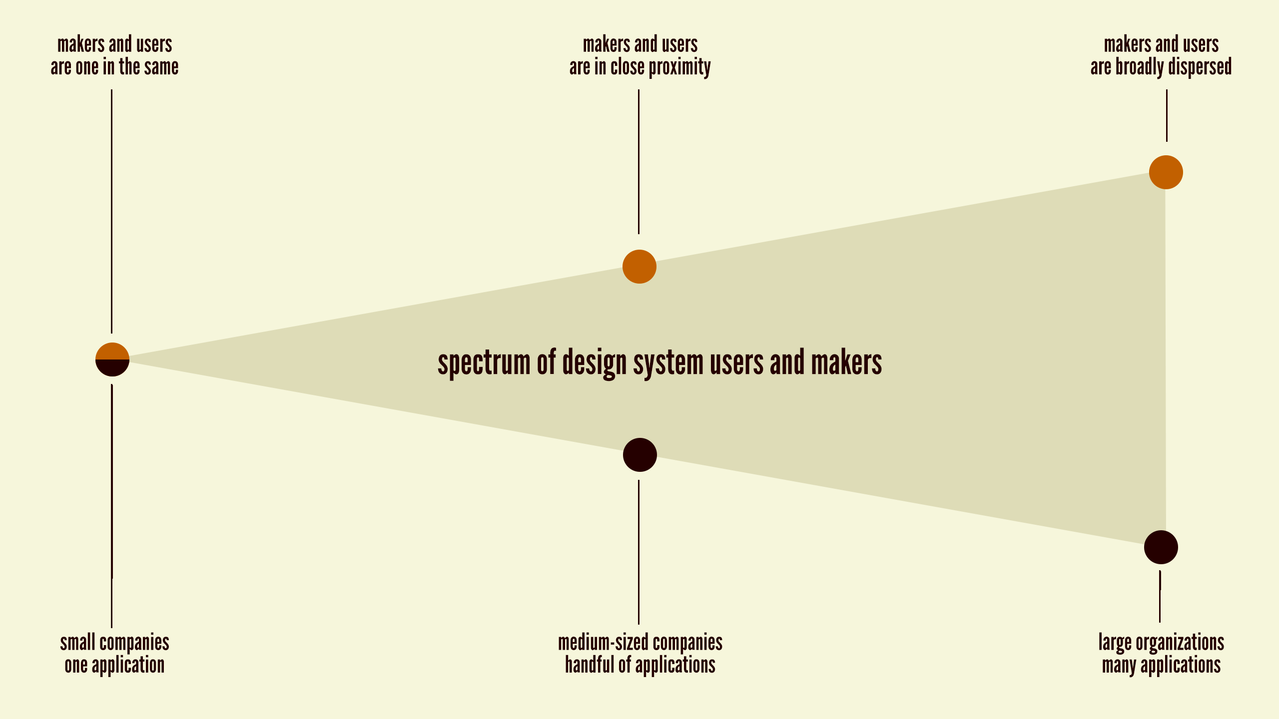
Design system makers and users
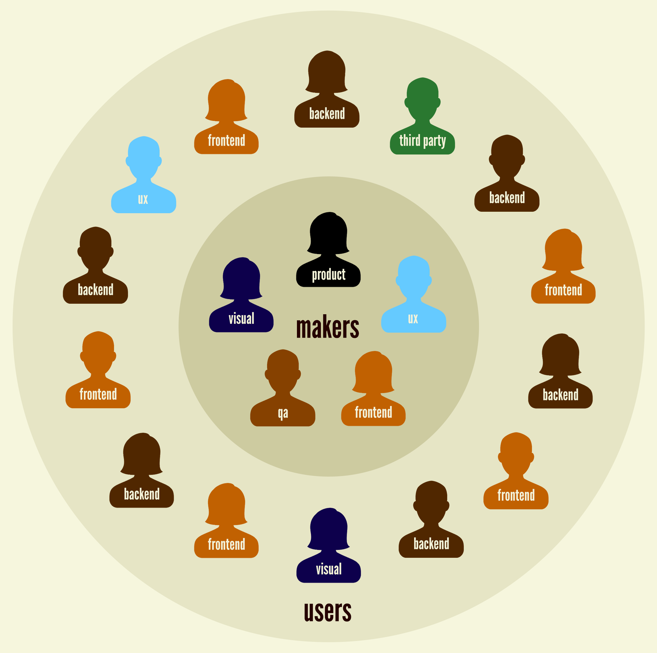
First things first. It’s important to recognize that there will inevitably be people at the organization who help make and maintain the design system, and there will be people who will be users of the design system. There may be overlap between these two groups, but establishing the roles of makers and users is important nonetheless.
When I talk about establishing a more collaborative process like the one I detailed in the previous chapter, I inevitably hear people who work at large organizations say, “But Brad, we have hundreds (or even thousands) of developers working on our products. Getting all those people to collaborate and contribute like that would be far too difficult.”
They’re likely right. It would be ideal if the entire organization adopted nimbler, more collaborative processes, but the daunting logistics around such an effort makes it improbable. But here’s the thing: not everyone in the organization needs to contribute directly to the design system, but someone (or more likely, some people) must take ownership of it.
The design system makers are the ones who create, maintain, and govern the system, and they need to work closely together to ensure that the system is smart, flexible, scalable, and addresses the needs of the users and business. The design system users are the teams across the organization who will take the system and employ its interface patterns to specific applications.
The design system makers and design system users need to maintain a close working relationship to ensure the patterns defined within the system serve the needs of the applications, and that all documentation is clear. Makers provide a birds-eye perspective of the entire ecosystem the design system serves, while users provide an on-the-ground perspective focused on specific applications of the system. Jina Bolton of Salesforce sums up the relationship between makers and users quite nicely:
The Design System informs our Product Design. Our Product Design informs the Design System. Jina Bolton, Salesforce
Both outlooks are critical to the success of the design system, which is why it’s so important for makers and users to have a healthy relationship that involves frequent communication and collaboration.
Design system makers
Who updates the design system? Who approves changes? Who communicates with the users of the design system to make sure it’s addressing their needs? Who gets to decide which patterns stay, go, or need tweaking?
The answers to these questions will very much depend on the size and setup of your organization.
Large organizations are able to dedicate serious resources to managing design systems. Salesforce, for example, maintains an official design systems team, which currently includes about a dozen full-time employees, last I heard. That dedicated team is responsible for governing the design system and making sure it’s meeting the needs of the internal product teams, as well as external developers who build things on the company’s platform. When a design system is serving literally thousands of users, it’s a smart idea to dedicate at least a few full-time employees to manage and expand the system.
Smaller organizations most likely don’t have the luxury of building an entire team to service a design system. Team members in smaller organizations have to wear many (hopefully stylish!) hats out of necessity, so governing the design system will likely become another responsibility. This may sound like an added burden (“Oh great, yet another thing I’m responsible for that doesn’t involve a pay raise!”), but this particular hat should be a joy to wear as it improves the efficiency and quality of all other work. Hooray for design systems!
Typically, design system makers at smaller organizations will be senior-level staff who have the experience to make thoughtful decisions, and the authority to enforce the design system.
And then there are external agencies, contractors, and consultants. What is the role of a third party when it comes to long-term maintenance of a client’s design system? On one hand, external partners are at a bit of a disadvantage since they don’t actually work for their client’s organization. A successful design system needs to become part of an organization’s DNA, and since third parties exist outside the company’s walls, their influence is intrinsically limited.
But on the other hand, external parties can often provide a sense of perspective that’s hard to see while working inside a company. This is where outsiders can really shine. In my work as a consultant, I work with organizations to establish long-term design system maintenance strategies, and help get the right people and processes in place. While the long-term success of the system will ultimately be up to the organization, third parties can teach them to fish and provide important strategic guidance, feedback, and perspective.
Design system users
Who are the people responsible for using the design system to build new features and applications? Who are the people who talk with the system makers to report issues and request features?
Once again, the answers to these questions will largely depend on your organization’s size and structure.
Design system users may be the same team creating the design system, separate development teams within your organization, junior-level designers and developers, partner agencies, external development shops, or other third-party teams.
Users’ proximity to and involvement in the creation of the design system will undoubtedly vary. You may work on a singular product at a scrappy startup, so your small team could be simultaneously creating and using the design system. Or you may work at a large multinational corporation with development teams and third-party partners scattered all across the globe. If this is the case, design system makers and users may seldom (or ever) meet, which means that helpful documentation and a sharp birds-eye perspective become that much more important.
One of the biggest advantages of establishing a thoughtful design system is that it allows organizations to scale best practices. If all those best practices – responsiveness, accessibility, performance, UX, ergonomics, and so on – are baked into the system, users can simply plug in the patterns and reap the rewards. This means design system users don’t have to be senior-level designers or developers to produce good work; the design system serves as a quality control vehicle that helps users apply best practices regardless of each individual’s skill level.
Design system team makeup
A cross-disciplinary team should be established to properly manage, maintain, and extend the system. All disciplines at an organization – UX designers, visual designers, content strategists, front-end developers, back-end developers, product managers, project managers, executives, and other stakeholders – have unique perspectives that can undoubtedly inform and shape the work. Incorporating these perspectives into the design system is important, but doesn’t necessarily require every discipline to be constantly involved in developing it.
There will inevitably be disciplines that actively do the work, while others may take on more of an advisory role. Those responsible for designing and building the user interface – UX designers, visual designers, front-end developers — will likely serve as the hands that do the work and make updates to the design system. They should work collaboratively (as detailed in chapter 4) and coordinate with other disciplines to ensure that the system reflects the values and considerations of the entire business.
Other people may not be the ones actively doing the work, but must be consulted to make sure their perspectives are properly reflected in the system. Back-end engineers need to make the team aware of any architectural decisions that would affect the front-end UI; executives need to make the team aware of important initiatives that will affect the role and utility of the system; and, of course, design system users need to coordinate with the makers to ensure the system serves the needs of individual applications.
Make it adaptable
Change is the only constant, as they say. The living part of a living design system means that it needs to roll with the punches, adapt to feedback, be iterated on, and evolve alongside the products it serves.
A misconception about design systems is that once they’re established, they become an omnipotent and unchangeable source of truth. Thinking in such a rigid way is a surefire way to have your design system effort backfire. If users feel handcuffed and pigeonholed into using patterns that don’t solve their problems, they’ll perceive the design system as a unhelpful tool and start searching elsewhere for something that will better address their needs.
Creating a clear governance plan is essential for making sure your design system can adapt and thrive as time goes on. A solid governance strategy starts by answering some important questions about handling change. Consider the following:
- What happens when an existing pattern doesn’t quite work for a specific application? Does the pattern get modified? Do you recommend using a different pattern? Does a new pattern need creating?
- How are new pattern requests handled?
- How are old patterns retired?
- What happens when bugs are found?
- Who approves changes to the design system?
- Who is responsible for keeping documentation up to date?
- Who actually makes changes to the system’s UI patterns?
- How are design system changes deployed to live applications?
- How will people find out about changes?
There are likely many more specific questions to answer, but the point is your team should have answers and processes in place to address inevitable changes to the system.
As mentioned a few times already, frequent communication and collaboration between makers and users is key for successfully governing your design system. Make it as easy as possible for users and makers to communicate. Set up a design system Slack or Yammer channel, establish regular office hours, make sure your bug ticket software helps facilitate conversation, and keep the doors open for ad hoc chats and calls. If users are stuck on something, they should know exactly where and who to turn to for help.
In addition to informal day-to-day conversation between makers and users, schedule regular “state of the union” meetings to review the design system with makers, users, and other key stakeholders. Discuss what’s working, be honest with what needs to be improved, and review priorities and the roadmap to make sure the system is serving the needs of the business. These regular checkups are especially helpful for keeping stakeholders up to speed, since they often aren’t involved in the day-to-day of the design system’s operations.
Making changes to patterns
A critical part of design system maintenance is ensuring that UI patterns stay up to date, embrace evolving design and development best practices, and continue to address the real needs of the organization.
Developing a strategy for handling pattern changes is crucial, which is why Inayaili de León Persson and the Canonical web team spent time to map out their strategy as they created the Vanilla front-end framework.
We thought that it would be good to document the process that a pattern should follow in order to become a Vanilla pattern, so after a little bit of brainstorming, we created a diagram that shows the different steps that should be taken from before submitting a pattern proposal to its full acceptance as a Vanilla pattern. Inayaili de León Persson, Canonical
The result is a gorgeous decision tree that maps out exactly what processes need to happen to add a new pattern to the design system.
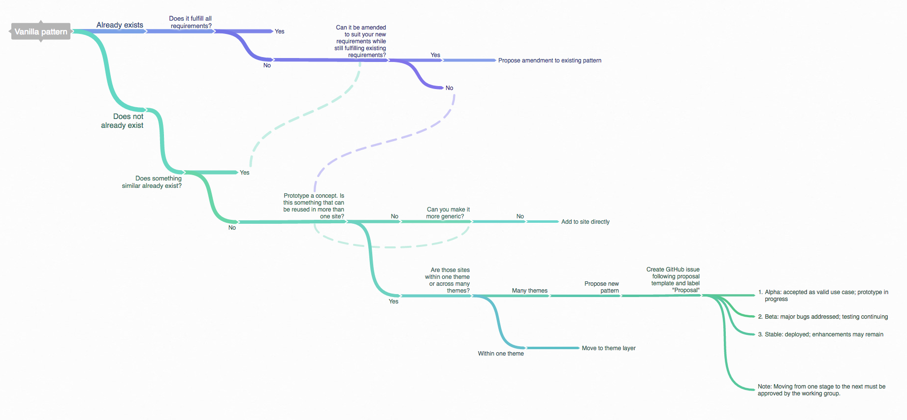
The three types of change that can happen to patterns in a design system are modification, addition, and removal.
Modifying patterns
UI patterns can and should be modified for a number of reasons: feature additions, bug fixes, subtle or major visual design tweaks, performance improvements, accessibility enhancements, code refactoring, UX best practice updates, and so on.
The design system maintainers need to understand why and when to tweak patterns, how to go about making those changes, and how to roll out those improvements into individual applications.
Keeping patterns fresh is essential for the long-term health of the design system. Nobody wants to use and maintain a Web 2.0-looking design system full of bevels and crusty code!
Adding patterns
As smart as your team surely is, it’s quite possible you won’t think of every conceivable pattern to include in your design system right out of the gate. As the system is applied to more products, gaps will inevitably emerge where the needs of the application aren’t solved by existing patterns. In such cases, it will become clear that new patterns will need created to address these needs.
Care should be taken when adding patterns to the library. If every whim results in a brand new pattern, the design system will become a bloated and unwieldy Wild West. It’s worth asking if this is a one-off situation or something that can be leveraged in other applications.
Perhaps you may want to assume a one-off until a different team encounters a similar use case. If the team working on Application 2 looks at Application 1 and says, “I want that!” perhaps that’s a good indicator that a one-off pattern should be added to the pattern library.
Removing patterns
Patterns can be deprecated for a number of reasons. Perhaps you discover through use that a particular pattern is a terrible idea. Hindsight is 20/20, my friend. Maybe the industry has moved away from a pattern for UX or technical reasons. Perhaps a pattern sat there unused by any application for ages. Maybe users reported back with a lot of negative feedback about working with a particular pattern.
Having a plan for deprecating patterns is a great idea. But how do you remove patterns from the design system without pulling the rug out from under people relying on those patterns in their applications? To address this issue, Salesforce created a neat utility called Sass Deprecate that flags patterns that are heading to the chopping block in the near future. Through some clever use of Sass variable flags and styling, the maker team can give a heads-up to users that a particular pattern is being deprecated, and recommend an alternative pattern instead.
Make it maintainable
With all this talk about modifying, adding, and removing patterns, you may be wondering, “How the hell are our applications supposed to actually keep up with all these changes?!” And in asking that question, you will have stumbled on to one of the biggest challenges organizations face in successfully maintaining a design system.
The biggest existential threat to any system is neglect. Alex Schleifer, Airbnb
Many systems fall into a state of disrepair because the effort required to make updates is far too high. If it’s difficult and time-consuming to update patterns, documentation, and applications, people will eventually get so frustrated that they stop making the effort and the design system will begin its drift into oblivion. Making updates to UI patterns, documentation, and applications should be as frictionless as possible, so reducing this friction should become a high priority for the design system team. This involves careful consideration from both technological and workflow standpoints.
In search of the holy grail
The design system holy grail involves creating an environment where the pattern library and live applications are perfectly in sync. The idea is that you should be able to make a change to a UI pattern and see that change automatically reflected in both the pattern library and anywhere the pattern is included in production.
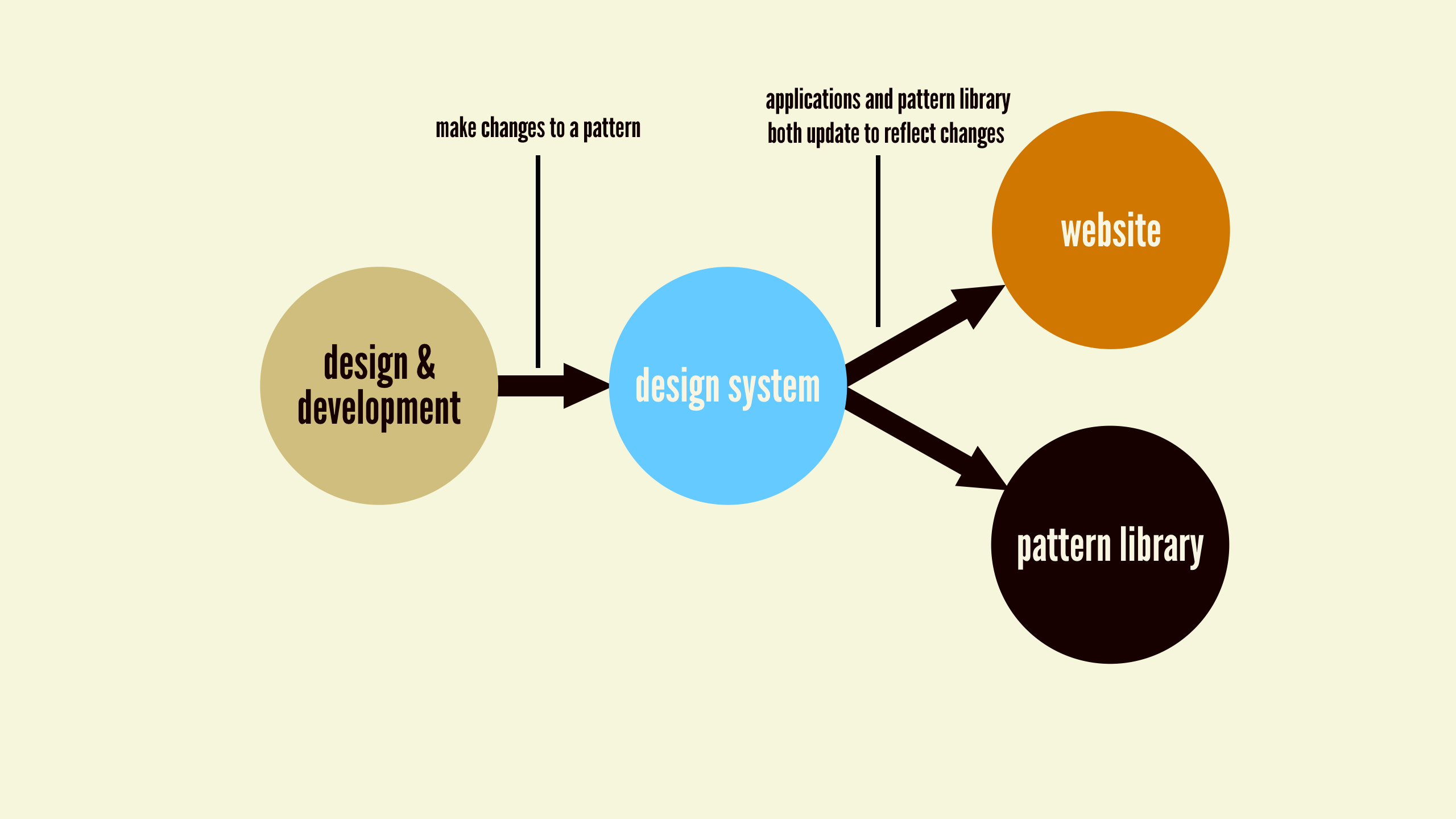
This technique removes any duplication of effort and ensures the pattern library and the applications using the patterns remain synchronized. Sounds like a dream, right?
As it turns out, this dream can be a reality. Lonely Planet, the travel guide company, was one of the first to establish a holy grail design system called Rizzo. Through some smart architecture, they created an API for their UI patterns that feeds into their production environment as well as their pattern library. The result is a centralized design system that ensures their live application and documentation remain perfectly in sync.
This approach is no easy task, as it requires sophisticated technical architecture, smart people to set it all up, and a relatively centralized organizational culture. How you go about chasing the holy grail – or even if you can achieve it – is dependent on a whole load of factors, including your technical architecture and organizational makeup.
Clearing technical hurdles
Keeping a pattern library in sync with production environments requires sharing code in a smart, scalable, and maintainable way. Detailing all the different technical strategies and considerations around the holy grail would necessitate its own book, but let’s cover a few important areas around keeping front-end code in sync.
The front-end of things
A UI design system manifests itself as the front-end of a web experience, which is comprised of HTML, CSS, and JavaScript. How we get that front-end code into a production environment, with complex application logic and back-end code, is the task at hand.
In his article “Chasing the Holy Grail*,” web developer Marcelo Somers details various technical approaches to achieving the holy grail. He highlights the pros and cons of each strategy for feeding a design system into applications to keep both codebases in lockstep. While I won’t detail each of Marcelo’s strategies, it’s worth noting there is a spectrum of approaches to choose from: crude, manual front-end code copying-and-pasting on one end, to baking the pattern library directly into the production environment on the other.
In my experience, I’ve found that sharing CSS and presentational JavaScript with production environments is relatively easy, while sharing markup is tough. Because CSS and JavaScript tend to get compiled into a single file (or perhaps a handful of files), it becomes possible to throw them onto a CDN and then simply link to those files in each application. Marcelo explains how to do this while keeping versioning in mind:
You’d provide development teams with a versioned URL (e.g., http://mycdn.com/1.3.5/styles.css) and upgrading is as simple as bumping the version number in the URL. Marcelo Somers
Sharing CSS and JavaScript is all well and good, but where things get tricky is when you want to share markup between environments. Why? you ask. Well, markup and back-end logic are often intertwined in an application’s codebase, which tends to make it difficult to simply copy and paste markup between your pattern library and production environments. Thankfully, there are ways around this problem.
Bridging the markup gap with templating languages
Using HTML templating languages (such as Mustache, Handlebars, Twig, Underscore, Jade, Nunjucks, and a slew of others) makes markup more portable and dynamic. Templating languages separate structure and data, and supercharge our HTML to keep us from having to write the same markup patterns over and over again. The good news is that many CMSes and application environments also make use of templating languages to serve up front-end markup.
The templating language can serve as the bridge between your pattern library and production environments. If you use a templating language to create the patterns in your design system (something we discussed at length in chapter 3), you can easily share those patterns with production environments that utilize the same templating engine.
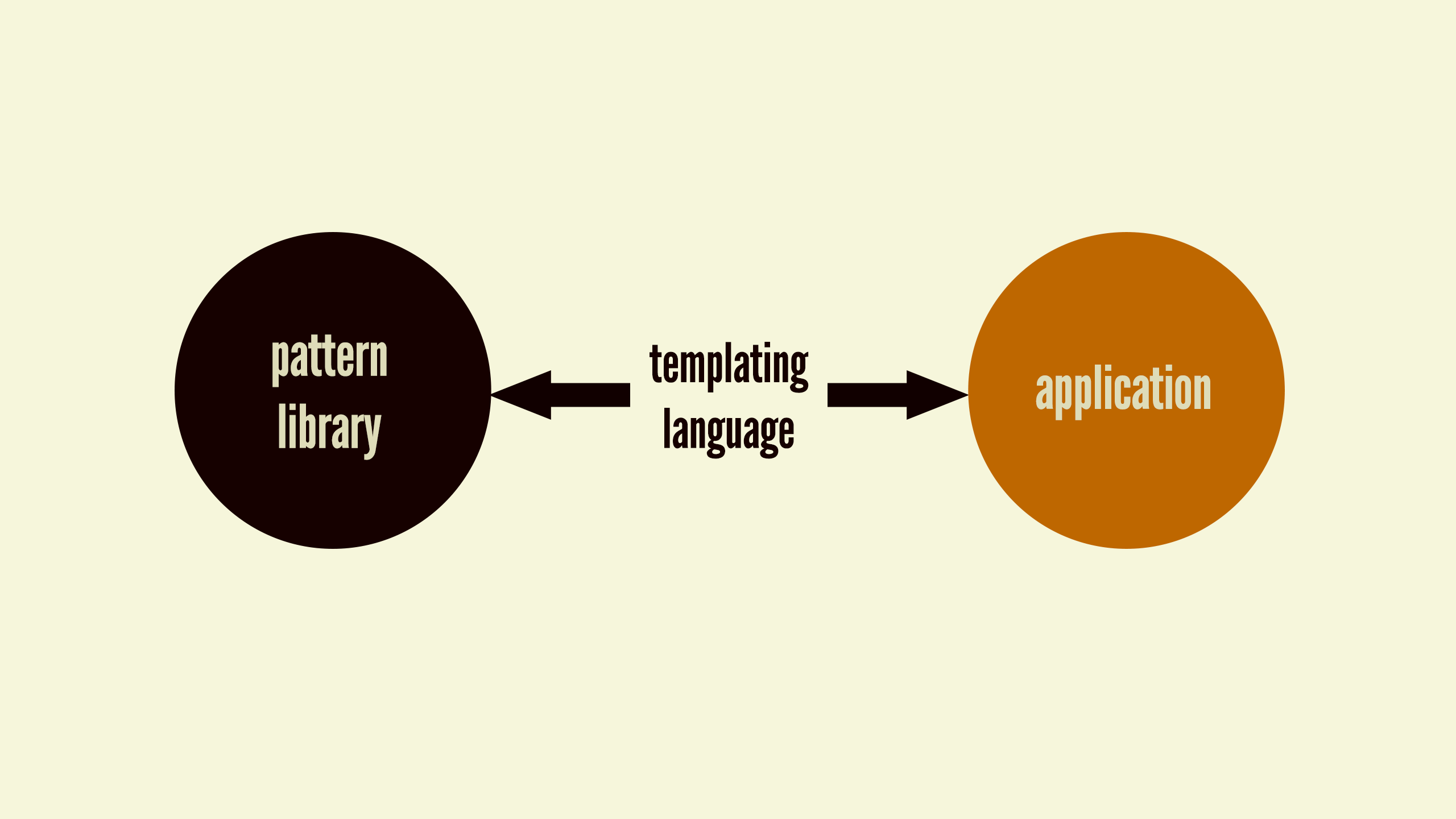
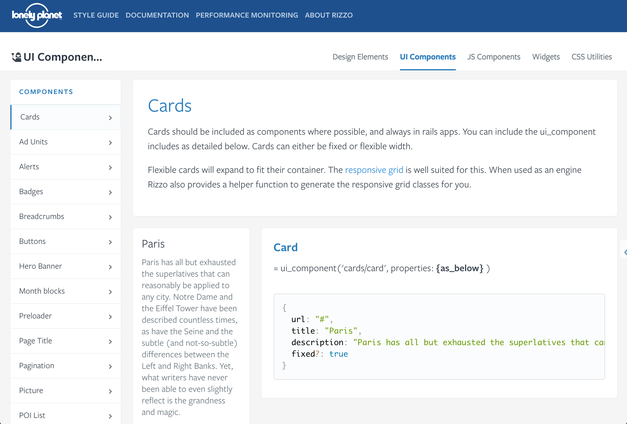
The team at Phase2 Technology achieved the holy grail by using Pattern Lab as their pattern library development tool and Drupal as their content management system. Because both Pattern Lab and Drupal support the popular Twig templating engine, Phase2 is able to easily share patterns between the two environments, ensuring their clients’ pattern libraries and production builds are always in step with each other.
By using the same templating engine, along with the help of the Component Libraries Drupal Module, the tool gives Drupal the ability to directly include, extend, and embed the Twig templates that Pattern Lab uses for its components without any template duplication at all! Evan Lovely, Phase2 Technology
Is your culture holy grail compatible?
You may have read that last section and thought, “That’s amazing! My company needs this now!” While holy grail systems are indeed great, there are reasons why you may not be able to automagically keep your production environments and pattern library in sync. Perhaps your organization creates tons of digital products on many different platforms using wildly different technologies. Maybe you’re a giant multinational company scattered all over the world. Maybe your company has an extremely decentralized, autonomous culture. Or maybe you’re a gigantic federal government.
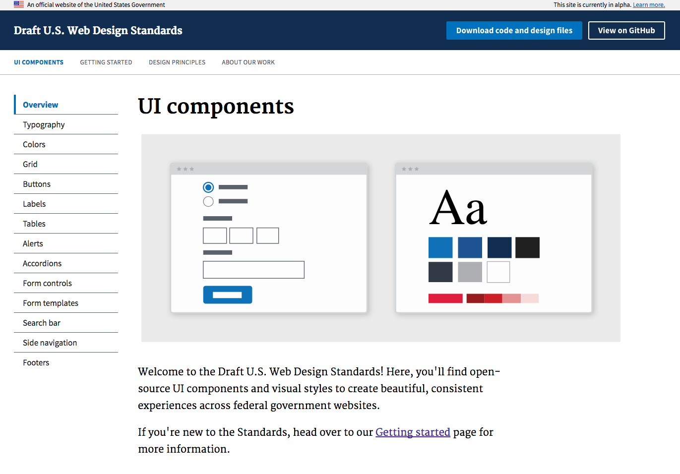
The U.S. government’s design system – called the Draft U.S. Web Digital Standards – is a collection of UI components and visual styles created to help people making government websites build more consistent UIs. The design system provides markup and styles for users to download and weave into their applications. It would certainly be amazing to see a holy grail design system implemented at such a gigantic scale, but as you might imagine, that’s a pretty tall order. The vastness and decentralized nature of the organization means that a synchronized pattern library isn’t really achievable without some dramatic restructuring of how federal government websites get built.
If a relatively scattered, decentralized culture is your reality, don’t be disheartened! Even getting some design system in place – a handful of go-to UI patterns, some helpful documentation, and guiding principles – can show your organization the light that points towards the grail. As we’ve discussed throughout this chapter, these efforts should be ongoing, and before you can run you must first learn to crawl.
Make it cross-disciplinary
Style guides often jump straight into code snippets and pattern usage for the benefit of the design system users. Of course, a pattern library needs to be helpful for the people actually making use of the patterns, but treating a style guide solely as a developer resource limits its potential.
A style guide has the opportunity to serve as a watering hole for the entire organization, helping establish a common vocabulary for every discipline invested in the success of the company’s digital products. Establishing this common vocabulary can lead to more efficient work, better communication, and more collaboration between disciplines across the organization. That’s why the style guide should be an inviting place for everybody, not just design system users.
Take the carousel (please!). This component is amazingly complex from an organizational standpoint. A homepage carousel on an e-commerce website requires input from a host of disciplines across the organization. Business owners and editorial staff must choose products to be featured in the carousel. Copywriters must ensure the copy is effective and stays within the constraints of the design. Art directors need to make certain the aesthetic design is pleasing and the product photography is legible across every screen size. UX designers have to confirm the functionality and controls are intuitive. Front-end people must be sure the component is responsive, accessible, and performant. Back-end developers need to ensure the component is properly wired up to the back-end system. You get the idea.
A well-crafted style guide can help manage all these moving parts and ensure the many perspectives that influence each pattern are properly documented in the style guide. Make the pattern library accessible to every discipline, and think about how to make it easy and inviting for different disciplines to contribute to the documentation.
Make it approachable
It should come as a surprise to no one that people tend to gravitate towards attractive things. A big part of making a style guide a cross-disciplinary resource is ensuring the container that houses your pattern library and other documentation is good-looking, inviting, and easy to navigate.
Taking the time to craft an attractive home for your style guide and documentation can lead to more usage, help build awareness, help create organizational investment, and help get non-developers’ eyeballs on the style guide. All of this contributes to that important shared vocabulary that leads to better cross-disciplinary collaboration.
But creating a great-looking, intuitive style guide experience doesn’t just happen, and this can be problematic when getting a style guide off the ground. If teams think that making a useful style guide involves making some Big, Official Thing with custom branding and a glossy website, they might be deterred from ever starting the initiative. So remember:
- Make a thing.
- Show that it’s useful.
- Make it official.
Creating a useful design system should be the team’s first priority. Building a happy home to contain it all might not happen straightaway, but should become a bigger priority once the design system becomes official. Making a good-looking style guide isn’t just design for design’s sake; it reflects an organization’s commitment to making and maintaining a thoughtful, deliberate design system.
Make it visible
Visibility is critically important to the ongoing health of your design system. Such an important endeavor shouldn’t be tucked away in a dark corner of your intranet. What steps can you take to ensure the design system remains a cornerstone of your design and development workflows?
Design system evangelism
You can create the best style guide in world, use the most sophisticated technology, have an amazing team in place, and have excited users, but if you don’t actively promote the design system and communicate changes, the entire effort will suffer greatly.
Evangelizing your design system efforts can and should happen even before the system is off the ground. At the onset of your project, you can set up places to document progress of the project to help garner awareness and excitement for the design system effort. One client of mine set up an internal blog to publish updates to the project, as well as a design system Yammer channel where developers and other interested parties can share ideas, address concerns, give feedback, and ask questions. Establishing a culture of communication early in the process will increase the likelihood of the design system taking root.
Communicating change
Once the design system is off the ground and is being used in real applications, it’s imperative to communicate changes, updates, and an ongoing vision to the entire organization.
The tactics for this communication can vary from nuts-and-bolts utilities to more outward-facing marketing efforts. Here are some materials that can help communicate change:
- Change logs: “Here’s what’s changed in the pattern library this month.”
- Roadmap: “Here’s what’s coming up over the next few months.”
- Success stories: “Team X launched this great new application using the design system; read more about how they did it.”
- Tips and tricks: “Here are a few best practices and considerations for using our system’s buttons throughout your application.”
Having a base for all these materials is a great idea, and keeping them adjacent to (or even within) the style guide itself makes a lot of sense as well.
Design system changes, updates, and requests should be communicated wherever your team hangs out. That may include Slack, Basecamp, GitHub, wikis, Yammer, email lists, company blogs, intranets, and any other internal tools your team uses to communicate and collaborate. If that sounds like a lot of work to you, fear not! Keeping your team and users updated doesn’t have to require a huge manual effort. Thanks to the connected nature of our tools, teams can automatically get alerted to changes via software, as Micah Sivitz from Shyp explains:
Whenever someone makes a pull request, it sends a notification to our #Design slack channel, announcing to the team that there is a proposal change and feedback is required. Micah Sivitz, Shyp
Baking this communication into the team’s everyday workflow keeps makers, users, and stakeholders engaged, and helps reassure users that the pattern library is being actively maintained and improved.
Training and support
You wouldn’t hand someone a hammer, saw, and screwdriver then say, “All right, you’ve got what you need; now go and build me a beautiful new house.” Knowing how to properly use a tool is often even more important than that tool’s availability. Documentation in the form of a style guide is no doubt helpful, but by itself it’s not enough. It’s essential to provide adequate training and offer ongoing support for your design system’s users to ensure they successfully get up and running with the tool kit and continue to create great work with it.
Training users how to work with the design system can take many forms, including:
- Pair sessions: Nothing beats pulling up a chair and working together on a project. While more time-intensive than other training vehicles, it’s the best way to get makers and users collaborating together, learning how the system works, and exposing new opportunities and shortcomings.
- Workshops: From immersive full-day sessions to quick walk-throughs, it’s incredibly helpful to set up face-to-face training workshops involving both makers and users. These sessions can help smooth out any misconceptions about the system, help level-up users with hands-on guidance, and create a healthy relationship between the people in charge of maintaining the system and the people in charge of working with it.
- Webinars: If workshops or pair sessions aren’t possible, or you need to train a lot of users at scale, webinars can be fantastic. Users can tune into online sessions to learn about how to properly use the system. When conducting webinars, be sure to build in plenty of Q&A time to field both audio and typed questions, concerns, and comments.
- Tutorials: A series of blog posts and screencasts can neatly encapsulate core concepts of working with the design system. Not only do these help serve as a training tool, but they can serve as a great reference to keep coming back to.
- Onboarding: A great way of injecting your design system into your company culture is to bake design system training right into the onboarding process for new employees. New colleagues will understand the importance of modularity, reuse, and all the other benefits a design system brings.
Users will undoubtedly have questions or encounter issues once they get up and running and start building things with the design system. They need to know there’s a robust support system in place to help answer any questions, listen to their requirements, and address bugs. There are a host of mechanisms in place to provide support for users, including:
- Issue trackers: Tools like JIRA and GitHub Issues are great for users and makers to report bugs and have technical conversations. Users should be aware of the protocol for filing bugs and feel empowered to contribute.
- Office hours: Schedule regular times when the design system team is available to field questions, address issues, and talk about what’s next for the design system.
- Slack and chat tools: The real-time nature of many of our work collaboration tools presents a huge opportunity to keep the pattern-laden conversation going. Thanks to tools like Slack, Yammer, and HipChat, makers and users can engage one another whenever and wherever.
- Forums: Communities like Stack Overflow and GitHub have proved to be extremely effective at enabling grassroots, community-driven support. Rather than design system makers becoming a support bottleneck, it can be worthwhile to open up support to the entire user community.
- Outreach: Not everyone has the time or the personality to ask questions and suggest changes. Design system makers should be proactive and reach out to developers using the design system to see if they have any issues or concerns. These kinds of actions can help build a genuine and positive relationship between makers and users.
Thanks to tools like GitHub, design system users don’t have to be relegated to the role of dumb consumers. The people who use the system day in and day out can be extremely valuable contributors to the design system if given the chance. Embrace the fact that users are eager to pitch in and make the system as great as it can be. Here are some tactics for encouraging user contributions:
- Suggestions and pull requests: Encourage anyone using the design system to suggest changes and new features. Better yet, invite users to submit changes in the form of pull requests that can be merged directly back into the codebase.
- Individual interviews and roundtable discussions: It’s always a good idea to talk to users, so regularly schedule time to chat with the people who are touching these patterns on a regular basis. Take it all in, listen to both the good and the bad, and collectively determine a plan of attack to address any issues and suggestions.
- Requests for feedback: Managing a system that can potentially be deployed to hundreds of applications can be tricky. Before pulling the trigger on decisions that could impact a lot of people, ask for opinions: “We’re considering deprecating our carousel pattern and would like to hear what you think.”
- Surveys: If interviews aren’t feasible, you can lean on quick surveys to get a feel for how effective UI patterns and the style guide are. Questions like “On a scale from one to five, how useful is the pattern documentation? Any suggestions?” can help identify blind spots and get users to suggest features that would make their lives easier.
- Regular “state of the union” meetings: Schedule regular meetings where the design system team discusses the product roadmap, lessons learned along the way, and suggestions and feedback. Encourage anyone to join the meeting, and be sure to record and distribute these sessions so everyone is aware of the master plan.
Make it public
Communicating change, evangelizing, and setting up proper training and support are all great things to increase your system’s visibility. But there’s another big opportunity to take your communication strategy to another level: making your style guide publicly accessible.
Why? Isn’t a style guide merely an internal resource to help people in your organization work better together? What use is it to the outside world? And wouldn’t publishing your style guide give away all your trade secrets?
Publishing your style guide for the world to see increases its visibility, increases accountability, and serves as an amazing recruitment tool.
Putting your style guide behind a login or firewall reduces visibility and adds an unnecessary burden to your team and partners, which limits the resource’s effectiveness and potential. And the fears about giving away your trade secrets are completely unfounded. These are UI patterns, not nuclear codes.
In addition to making important documentation easier to access, a public style guide helps create organizational accountability. Publishing your style guide demonstrates your organization’s commitment to the design system, which creates a helpful bit of pressure to keep it an up-to-date and useful resource.
Public-facing style guides are also hugely helpful for recruiting. Designers, developers, and people working in other disciplines want to work for organizations that embrace modern digital best practices, and (as we’ve discussed throughout this book) design systems are quickly becoming an industry-wide best practice. Publishing your style guide sends out a strong Bat-Signal that can attract passionate, pattern-minded people. For instance, style guide expert Jina Bolton went to work at Salesforce after seeing the company’s style guide for their Salesforce1 product.
When I saw [Salesforce’s style guide] I thought it was beautiful and it’s why I wanted to join this team. Jina Bolton
Since joining Salesforce, she’s helped create the ultra-successful Lightning Design System and helps manage their growing design system team. Jina’s story is not an isolated one; almost every guest Anna Debenham and I interviewed on the Styleguides Podcast discussed how helpful their public-facing pattern library was for attracting talent. All that means your public style guide makes your organization more competitive, not less.
Make it bigger
A visible, cross-disciplinary, approachable pattern library is one that your team will come back to again and again. Use that to your advantage. Since the team’s eyeballs are already fixated on that one resource, there’s a big opportunity to extend it to include other helpful documentation like the voice and tone, brand, code, design principles and writing guidelines we discussed in chapter 1.
Now, your organization may not need to implement every flavor of style guide out there, but the point is that creating a centralized style guide hub builds more awareness of best practices, increasing the documentation’s effectiveness.
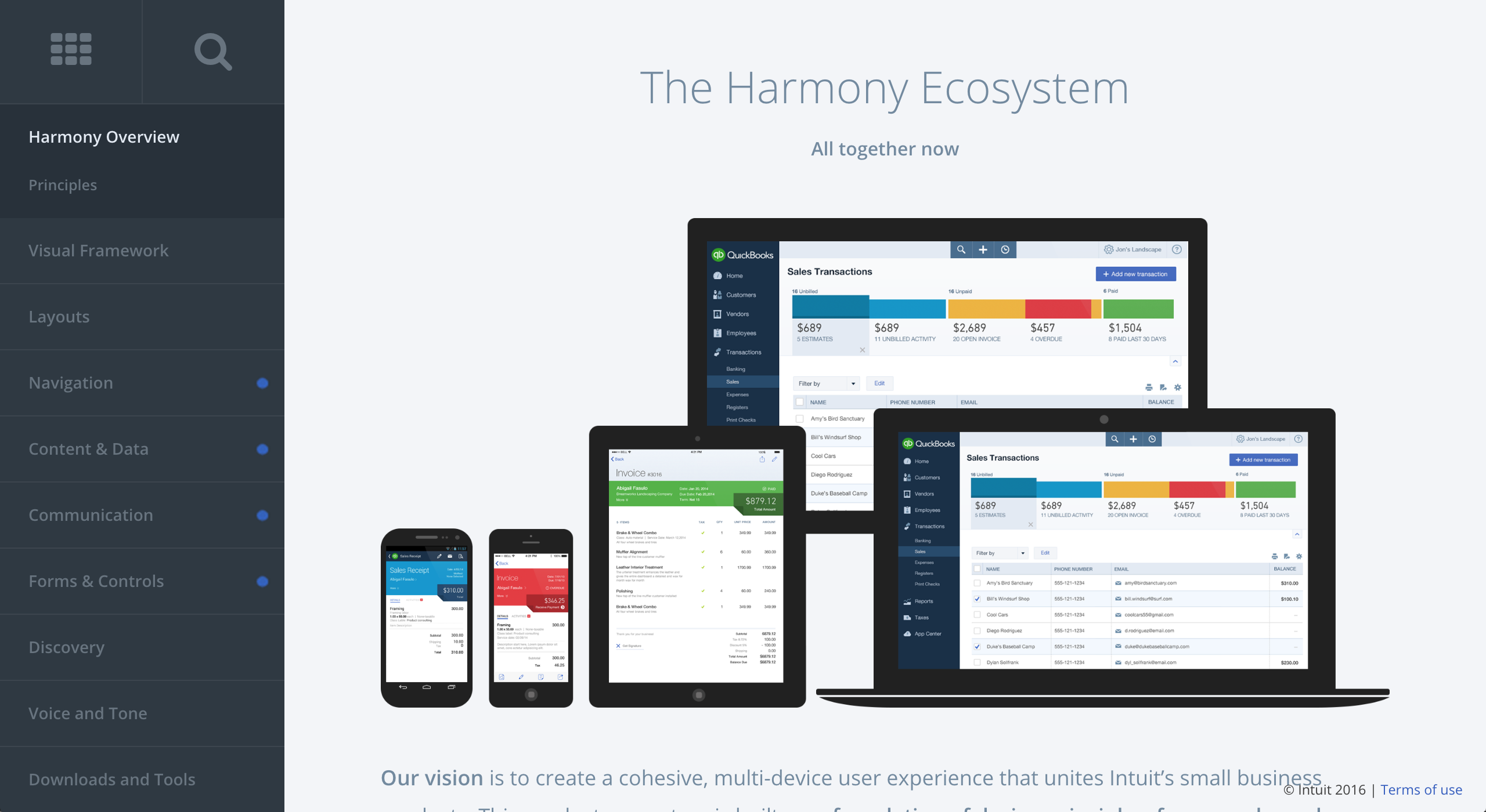
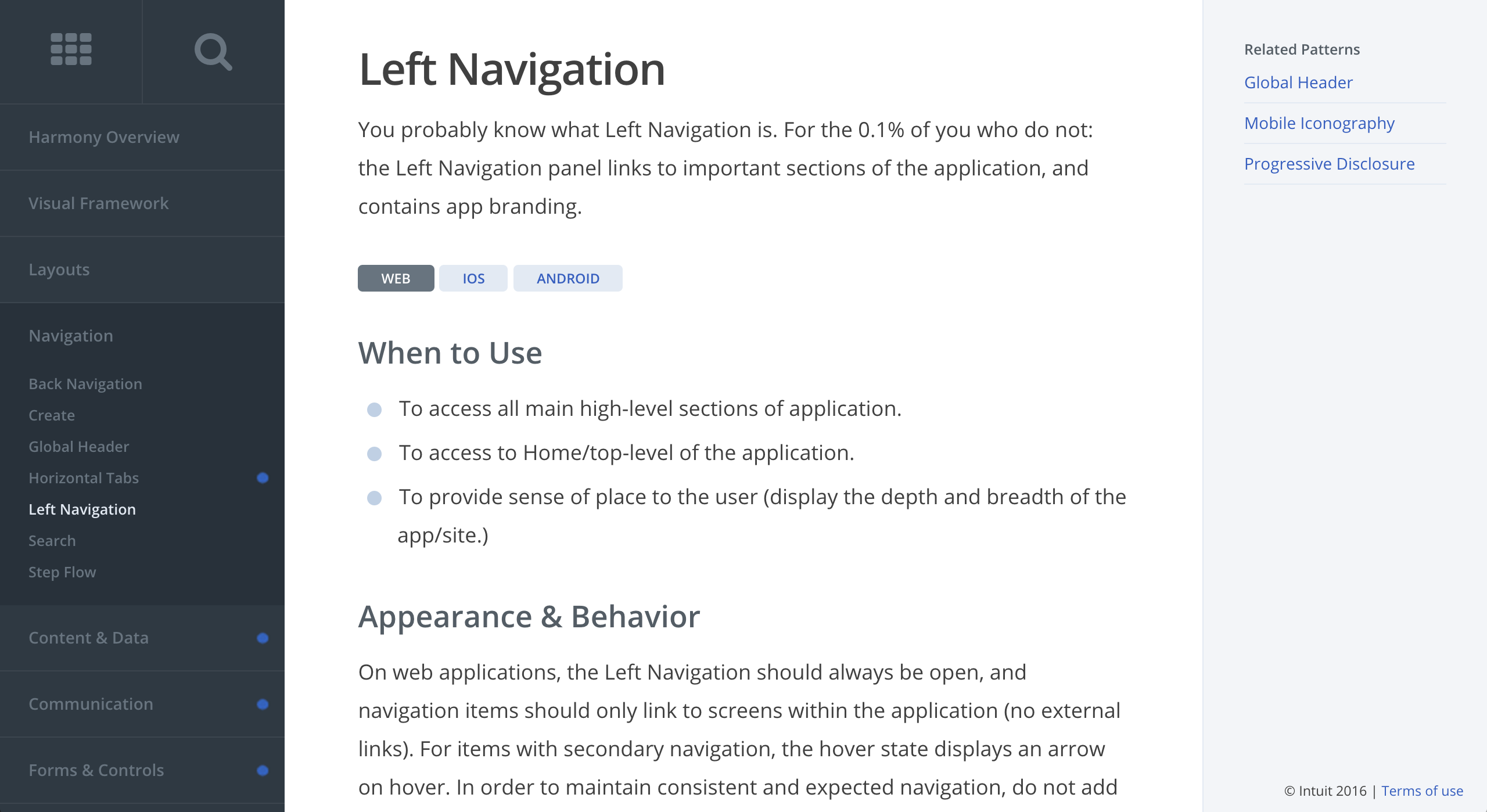
Another way to extend the functionality of the pattern library is to include guidelines for native platform patterns alongside web-based patterns. We can look to Intuit’s Harmony design system once again for an example of how native mobile platform patterns for iOS and Android can live beside their web-based counterparts.
Make it context-agnostic
The way your UI patterns are named will undoubtedly shape how they are used. The more agnostic pattern names are, the more versatile and reusable they become.
Because we tend to establish UI patterns in the context of a broader page, it can be tempting to name components based on where they live. But rather than naming your component “homepage carousel” (forgive my morbid obsession with carousels), you can simply call it “carousel,” which means you can now put carousels everywhere! (But for the love of all that is holy, please don’t.)
Another challenge for naming display patterns is that we tend to get distracted by the content patterns that live inside them. For instance, if working on an e-commerce site, you may be tempted to call a block containing a product image and title a “product card.” But naming things in this manner immediately limits what type of content can live inside it. By naming the pattern simply “card,” you can put all sorts of content patterns inside it: products, promotions, store locations, and so on.
Fair warning: naming things is really freaking hard. But there are strategies to help you create robust names for your patterns. Conducting an interface inventory (as detailed in chapter 4) helps remove patterns from the context of the page where they normally reside, meaning your team can create names that aren’t distracted by their context. I’ve conducted naming exercises with teams where we’ve blurred out the content residing inside a pattern so everyone can focus on the pattern’s structure rather than the content that lives inside it.
While naming things will always be a challenge, pattern names that are agnostic to context and content will be more portable, reusable, and versatile.
Make it contextual
Showcasing UI patterns in a pattern library is all well and good, but you need to demonstrate context for design system users to understand how and where to properly use them. Most pattern libraries show a demo of each UI pattern, but as we’ve discussed, those patterns don’t live in a vacuum. Where exactly are these patterns used?
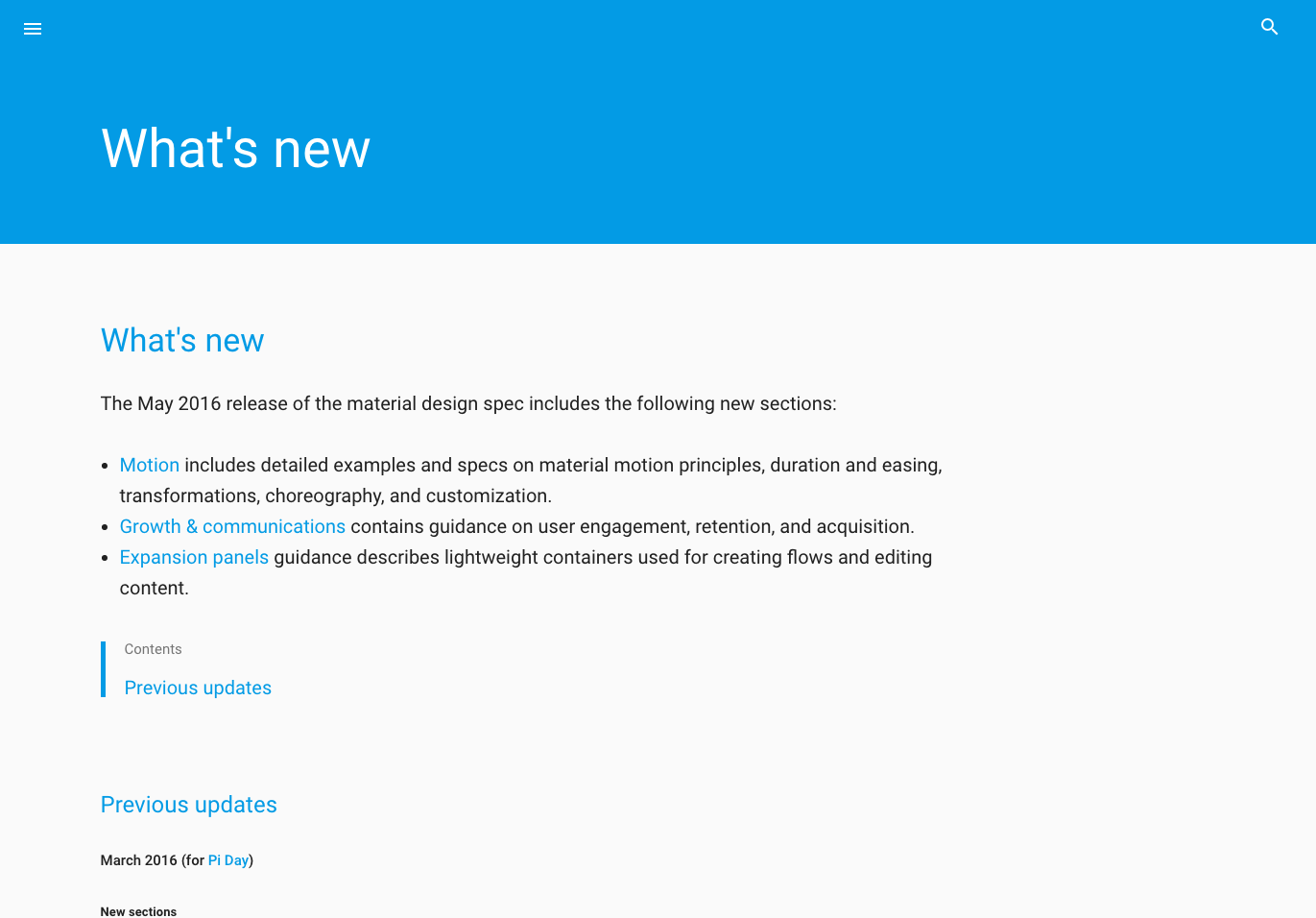
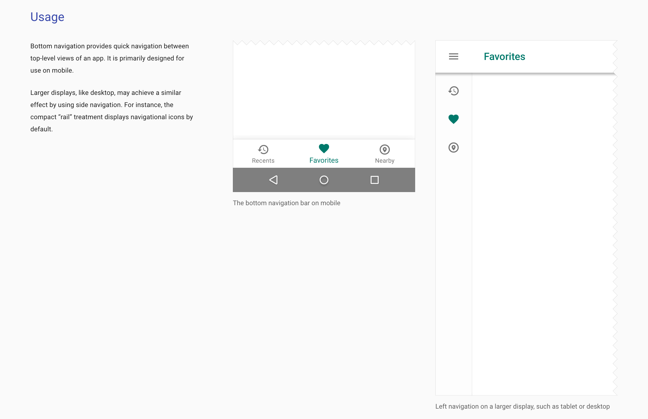
One way to demonstrate context might include showing screenshots or videos of a component in action. Material design’s documentation does a fantastic job at this; each component is rich with photos, videos, and usage details to give users a clear understanding of what these patterns look like in the context of an application, and demonstrate how each pattern should be used.
Another way to show context is to provide lineage information for each pattern. As we discussed in Chapter 3, a tool like Pattern Lab automatically generates this information, letting you see which patterns make up any given component in addition to showing where each component is employed. This provides a sort of pattern paper trail that helps immensely with QA efforts, as it highlights exactly which patterns and templates would need to be tested if changes were made to a particular pattern.
Make it last
Making a design system is an incredibly and important endeavor. But without proper maintenance, the value of your design system will depreciate much like a car that’s just been driven off the dealer’s lot. Instead, your design system should be like a bottle of fine wine that increases in value over time.

As we’ve discussed throughout this chapter, making your design system stand the test of time requires a significant amount of time and effort. But isn’t that the case with all living things? Animals need to eat, and plants need water and sunlight in order to survive. Creating a living design system means giving it attention and care in order for it to continue to thrive.
All that effort not only creates a better present for your organization, but sets you up for long-term success. Establishing a clear governance plan, communicating change, and implementing the other advice found in this chapter helps the design system take root and become an integral part of your organization’s workflow. Creating the damn thing in the first place is the hard part, but once established, you have a solid foundation with which to build on for years to come. Even if you were to burn everything down and rebuild a new system from the ground up, you’ll find your UIs will still need buttons, form fields, tabs, and other existing components. And you’ll need a happy home to display and document the system. Don’t throw the baby out with the bathwater!
So there you have it. To make a maintainable design system, you should:
- Make it official by allocating real time, money, and resources to your design system.
- Make it adaptable by counting on change and establishing a clear governance plan.
- Make it maintainable by seeking the holy grail and making it easy to deploy and communicate changes to the design system.
- Make it cross-disciplinary by making your pattern library a watering hole the entire organization can gather around.
- Make it approachable by making an attractive, easy-to-use style guide with helpful accompanying documentation.
- Make it visible by communicating change, evangelizing the design system, and making it public.
- Make it bigger by including brand, voice and tone, code, design principles, and writing guidelines.
- Make it agnostic by naming patterns according to their structure rather than their context or content.
- Make it contextual by demonstrating what patterns make up a particular pattern and showing where each pattern is used.
- Make it last by laying a solid foundation with which to build on for years to come.
Go forth and be atomic
We’re tasked with making a whole slew of products, sites, and applications work and look great across a dizzying array of different devices, screen sizes, form factors, and environments. I hope that the concepts covered in this book give you solid ground to stand on as you bravely tackle this increasingly diverse digital landscape. By creating design systems, being deliberate in how you construct user interfaces, establishing a collaborative and pattern-driven workflow, and setting up processes to successfully maintain your design system, I hope you and your team can create great things together. Go forth and be atomic!