In the previous chapter, I introduced the atomic design methodology for constructing user interfaces. I hope you’ll find atomic design to be a helpful mental model for constructing UI design systems, but now it’s time to climb down from the ivory tower and actually put atomic design into practice in the real world.
The cornerstone of pattern-based design and development is the pattern library, which serves as a centralized hub of all the UI components that comprise your user interface. As we discussed in chapter 1, the benefits of pattern libraries are many:
- They promote consistency and cohesion across the entire experience.
- They speed up your team’s workflow, saving time and money.
- They establish a more collaborative workflow between all disciplines involved in a project.
- They establish a shared vocabulary between everyone in an organization, including outside vendors.
- They provide helpful documentation to help educate stakeholders, colleagues, and even third parties.
- They make cross-browser/device, performance, and accessibility testing easier.
- They serve as a future-friendly foundation for teams to modify, extend, and improve on over time.
That all sounds wonderful, right? I can almost hear you saying, “I need this whole pattern library thing in my life.” But how do we make pattern libraries happen? Well, you’ve come to the right place, friend, because the rest of this book is dedicated to exactly that. This chapter will introduce helpful tools for creating pattern libraries, the next chapter will discuss how to make patterns a cornerstone of your design and development workflow, and the fifth chapter will cover how to make your design system stand the test of time.
This chapter will talk about the qualities of effective pattern libraries through the lens of a tool called Pattern Lab, an open source project maintained by web developers Dave Olsen, Brian Muenzenmeyer, and me to execute atomic design systems. While I’ll excitedly discuss Pattern Lab and its various features, I want to stress that the point of this chapter is to cover the characteristics of well-constructed pattern libraries, not sell any one specific tool to you. Hell, Pattern Lab isn’t even for sale! No single tool will be a perfect fit for every setup and scenario, but be sure to keep the following principles in mind when deciding what tools to use to create your pattern libraries.
Just what exactly is Pattern Lab?
Before we dive into the nuts and bolts of how Pattern Lab works, it’s important to take time to explain what the tool is and isn’t.
Pattern Lab is…
- a static site generator tool for building atomic design systems.
- a pattern documentation and annotation tool.
- a pattern starter kit.
Pattern Lab isn’t…
- a UI framework like Bootstrap or Foundation.
- language-, library-, or style-dependent.
- a replacement for a content management system.
Let’s walk through these points, starting with the term static site generator. Static site generator tools take in some source code and assets, compile them, and spit out plain ol’ HTML, CSS, and JavaScript at the other end. Pattern Lab takes source code – namely patterns — and compiles those patterns into a functional front-end UI inside a pattern library shell.
So what does Pattern Lab look like out of the box? Drumroll, please.
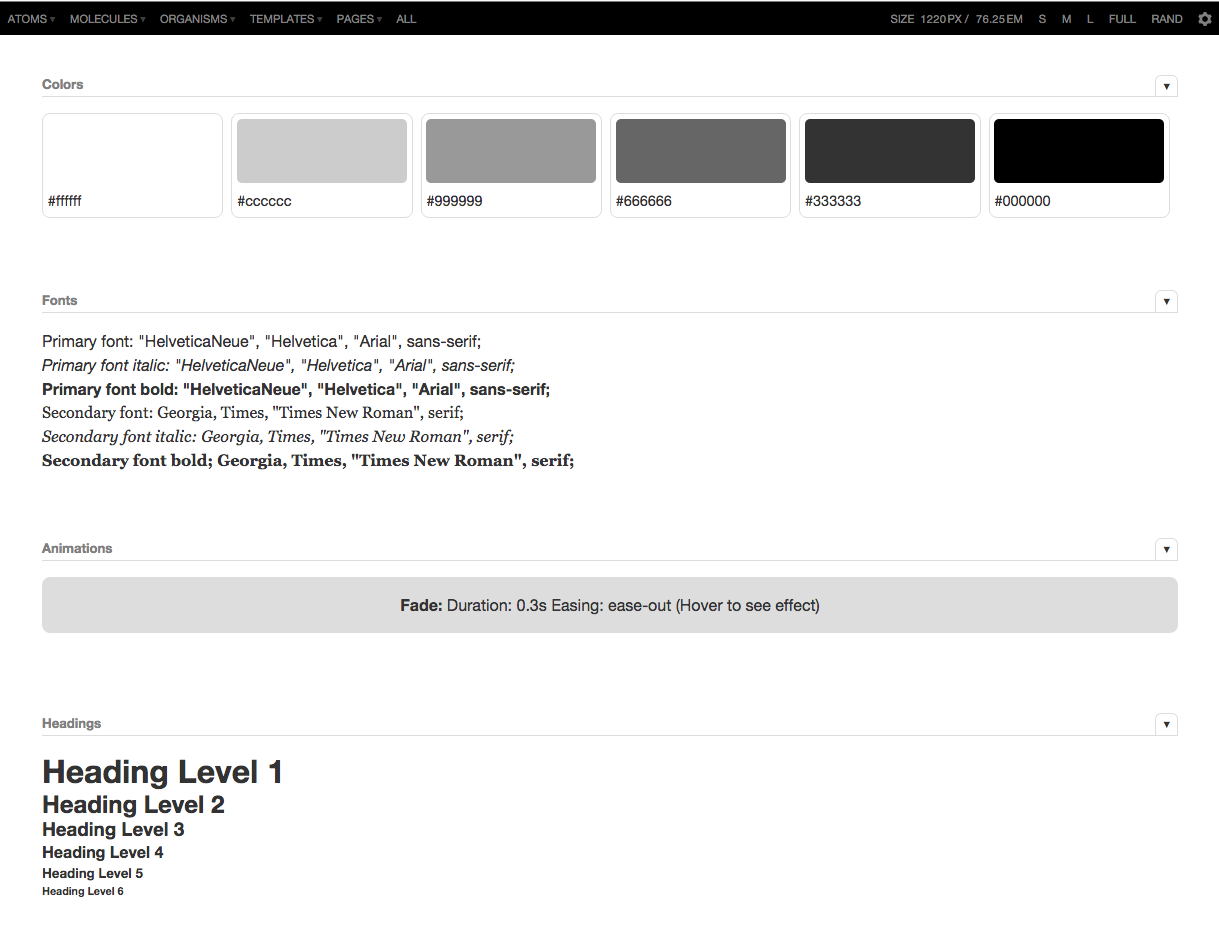
Not a terribly inspiring design, eh? Believe it or not, this minimal (one might even say lack of) design is deliberate. To avoid incorrect classification as a UI framework like Bootstrap, the design is deliberately stripped down so no one would mistakenly take Pattern Lab’s demo UI for suggested styles. Pattern Lab doesn’t give you any answers as to how to design or architect your front-end code—you have to do all that work yourself. The look and feel, naming conventions, syntax, structure, libraries, and scripts you choose to use to create your UI are entirely up to you and your team. Heck, you can even use UI frameworks like Bootstrap within Pattern Lab. Pattern Lab is just there to help stitch everything together.
As a technical aside, Pattern Lab uses either PHP or Node.js as the engine that stitches patterns together and generates the pattern library. However, you don’t need to be a PHP wizard or Node guru to use Pattern Lab any more than you have to know how to build an internal combustion engine to drive a car. Moreover, your final website doesn’t have to be built with PHP or Node to use the tool, as Pattern Lab’s output is backend-agnostic HTML, CSS, and JavaScript. So like any technology decision, choose a pattern library tool that fits with your organization’s infrastructure and jives with how your team works together.
If that all sounded like gibberish to you, don’t worry. This chapter focuses on the overarching features of Pattern Lab and principles of effective pattern libraries rather than going too far down the technical rabbit hole. If interested, you can check out Pattern Lab’s documentation to dive into the nitty-gritty.
Building atomic design systems with Pattern Lab
To understand the core concept behind Pattern Lab, you need to understand Russian nesting dolls.
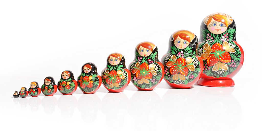
Matryoshka dolls (also known as Russian nesting dolls) are beautifully carved hollow wooden dolls of increasing size that are placed inside one another. Patterns in Pattern Lab operate in a similar manner: the smallest patterns (atoms) are included inside bigger patterns (molecules), which are included in even bigger patterns (organisms), which are in turn included in even bigger patterns (templates).
Constructing UIs in this manner keeps things DRY, which is a long-standing computer science principle that stands for “don’t repeat yourself.” What this means is that you can make a change to a pattern, and anywhere that pattern is employed will magically update with those changes. This Russian nesting doll approach considerably speeds up your workflow, and certainly beats the pants off sifting through hundreds of Photoshop documents for every instance of a pattern in order to make a simple change.
To make this happen, Pattern Lab uses the include feature of Mustache, a logicless templating language. Here’s what a Mustache include looks like:
{{> atom-thumbnail }}
This is Mustache code, in case the double curly braces ({{}}) that look like little mustaches didn’t give it away. The greater-than symbol (>) is Mustache’s way of telling Pattern Lab to include an atom pattern called “thumbnail”. Pattern Lab will go searching through its folders of patterns to find an atom named “thumbnail”.
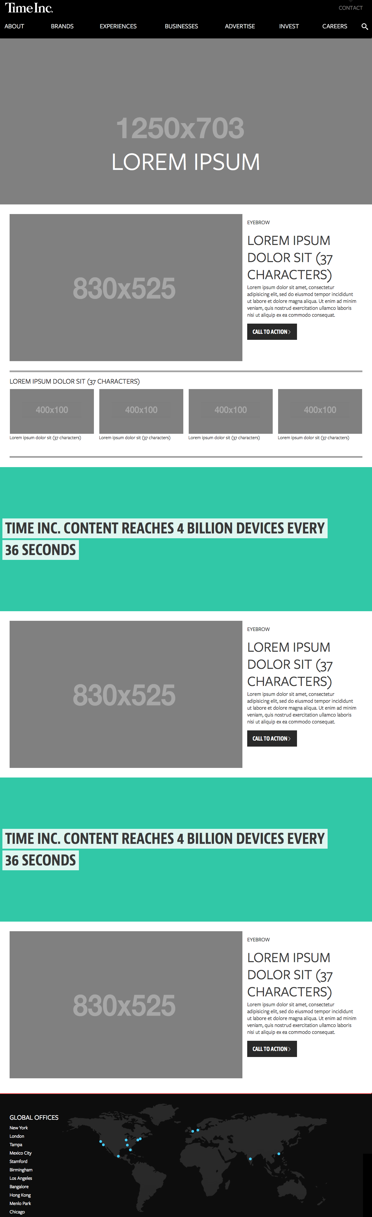
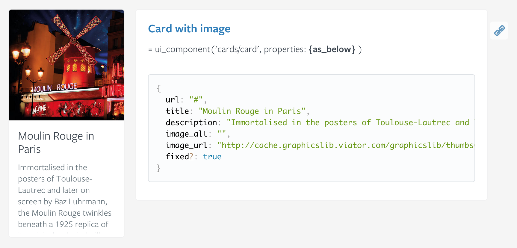
Now that we know what an include looks like, let’s put it into practice and take a look at a few patterns from a website I helped make for Time Inc. Here’s one reusable pattern we designed:
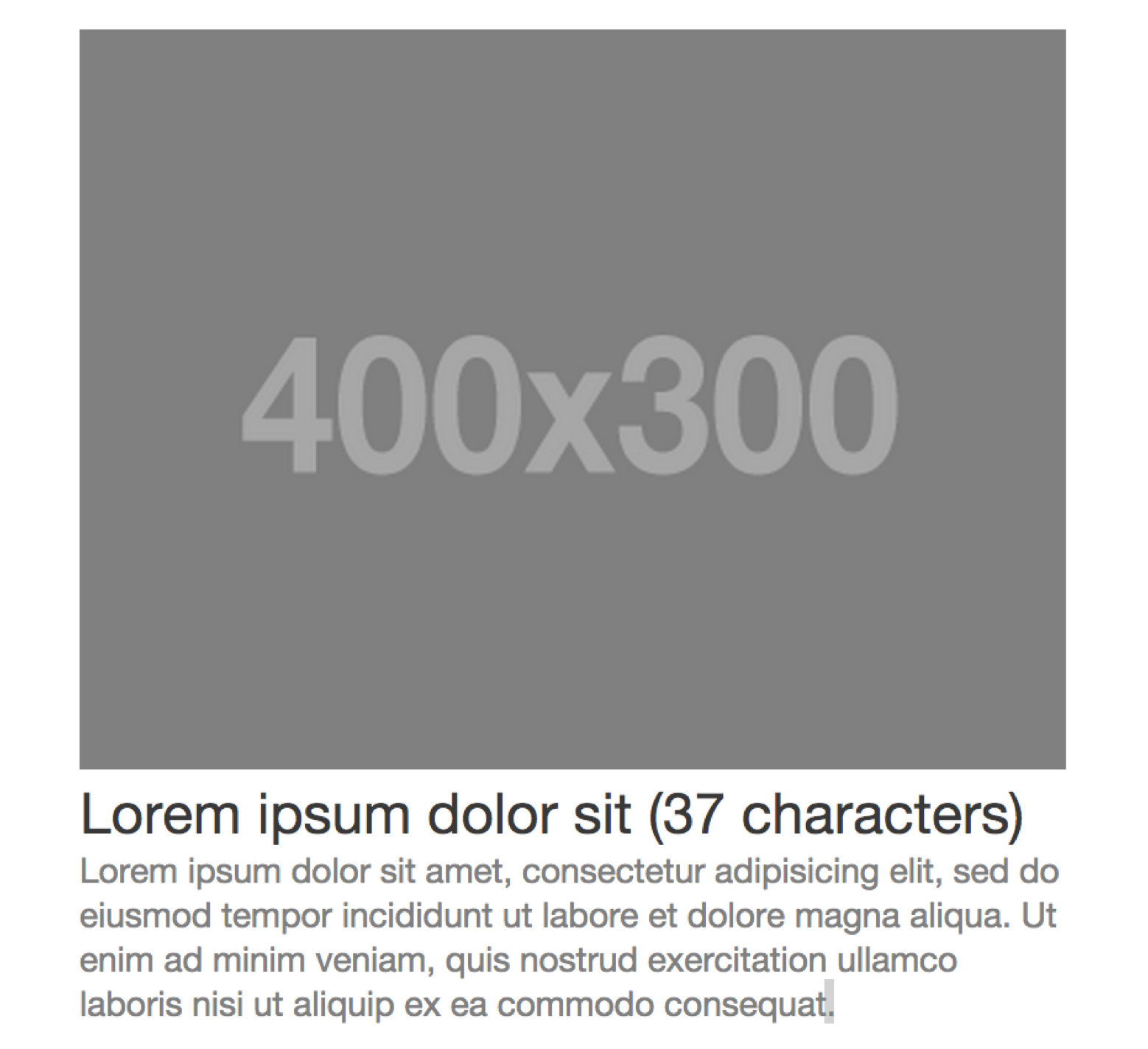
This pattern should look fairly familiar. A thumbnail image, headline, and excerpt working together as a single unit is a common pattern found on countless websites. Let’s take a peek behind the curtain to see how this pattern is constructed.
You can see we have: HTML markup consisting of a wrapper div with a class name of block-post; a link; a Mustache include for the thumbnail image; an <h3> element for the headline; and a <p> tag for the excerpt. You’ll notice there’s more Mustache code for url, headline, and excerpt, which we’ll use later to dynamically swap in actual content. More on that in a bit.
Now that our pattern markup is established, we can include that chunk of code in bigger patterns using the same include method:
{{> molecules-block-post }}
Now let’s move up to more complex organisms like the website’s header, which looks a little something like this:

When we crack open the hood to look at the header’s markup in Pattern Lab, we see the following:
<header role="banner">
    {{> atoms-logo }}
    {{> molecules-primary-nav }}
    {{> molecules-search }}
</header>
What’s going on here? Well, we have a basic <header> element, and inside that element we’re including the logo image atom, the primary navigation molecule, and the search form molecule.
And now we can include that relatively complex pattern anywhere we need it.
{{> organisms-header }}
I hope by now you can see the Russian nesting dolls in action. The smallest atoms are included in bigger molecules, and those molecules get included in even bigger organisms. Now let’s take these components and plug them into a layout. Take the homepage template, for instance:
Take a quick stroll through the homepage template and you’ll see some pretty standard patterns: a site header at the top, a site footer at the bottom, and a full-screen hero area. You’ll also see a few other patterns repeating themselves throughout the template.
So how does this look in code? As you might expect, it involves more includes!
{{> organisms-header }}
<main role="main">
    {{# hero }}
    {{> molecules-hero }}
    {{/ hero }}
    <section>
        {{# experience-block }}
        {{> molecules-block-main }}
        {{/ experience-block }}
        {{# experience-feature }}
        {{> organisms-story-feature }}
        {{/ experience-feature }}
    </section>
    <section>
        {{# factoid-advertising }}
        {{> organisms-factoid }}
        {{/ factoid-advertising }}
    </section>
    <section>
        {{# advertising }}
        {{> molecules-block-main }}
        {{/ advertising }}
    </section>
    …
</main>
{{> organisms-footer }}
At this stage in the game the smaller patterns are already constructed, so all the template needs to do is pull them into the context of a page layout and give them unique names.
Taking a closer look at the code, notice that certain patterns like {{> organisms-header }} and {{> organisms-footer }} are included the same way as the earlier examples. But there are also a few other includes patterns that are supplemented by some additional information, like the following:
{{# factoid-advertising }}
{{> organisms-factoid }}
{{/ factoid-advertising }}
We’re including organisms-factoid in the same way as all the other patterns, but we’re also naming it factoid-advertising by wrapping the include in a Mustache section, indicated by the Mustache code containing the # and / symbols. By giving the pattern instance a unique name, we can latch on to it and dynamically replace the content of the pattern. More on that in the next section!
This Russian nesting doll approach to building UIs is simple but tremendously powerful. The structure allows designers and developers to keep patterns DRY, saving time, effort, and money. The approach allows teams to build a final UI while simultaneously creating the underlying UI design system. After all, the final interface is one instantiation of its underlying design system. Teams can also move between abstract and concrete, zeroing in on a particular pattern to fix bugs (“The header’s broken!”), while also seeing how changes to small patterns affect the overall page layout.
Working with dynamic data
It’s important to articulate the underlying content structure of UI patterns within the context of a pattern library. That’s why we’ve been looking at dimension-displaying grayscale images and placeholder text containing character limits. But while this information is helpful for creative teams, grayscale images and Lorem ipsum text are not what users interact with on your actual site. We need a way to replace our dummy content with real representative content to ensure our UI patterns match the reality of the content that lives inside them.
To demonstrate how Pattern Lab dynamically swaps in real content into templates, let’s take a look at a side-by-side comparison of Time Inc.’s homepage template and page levels:
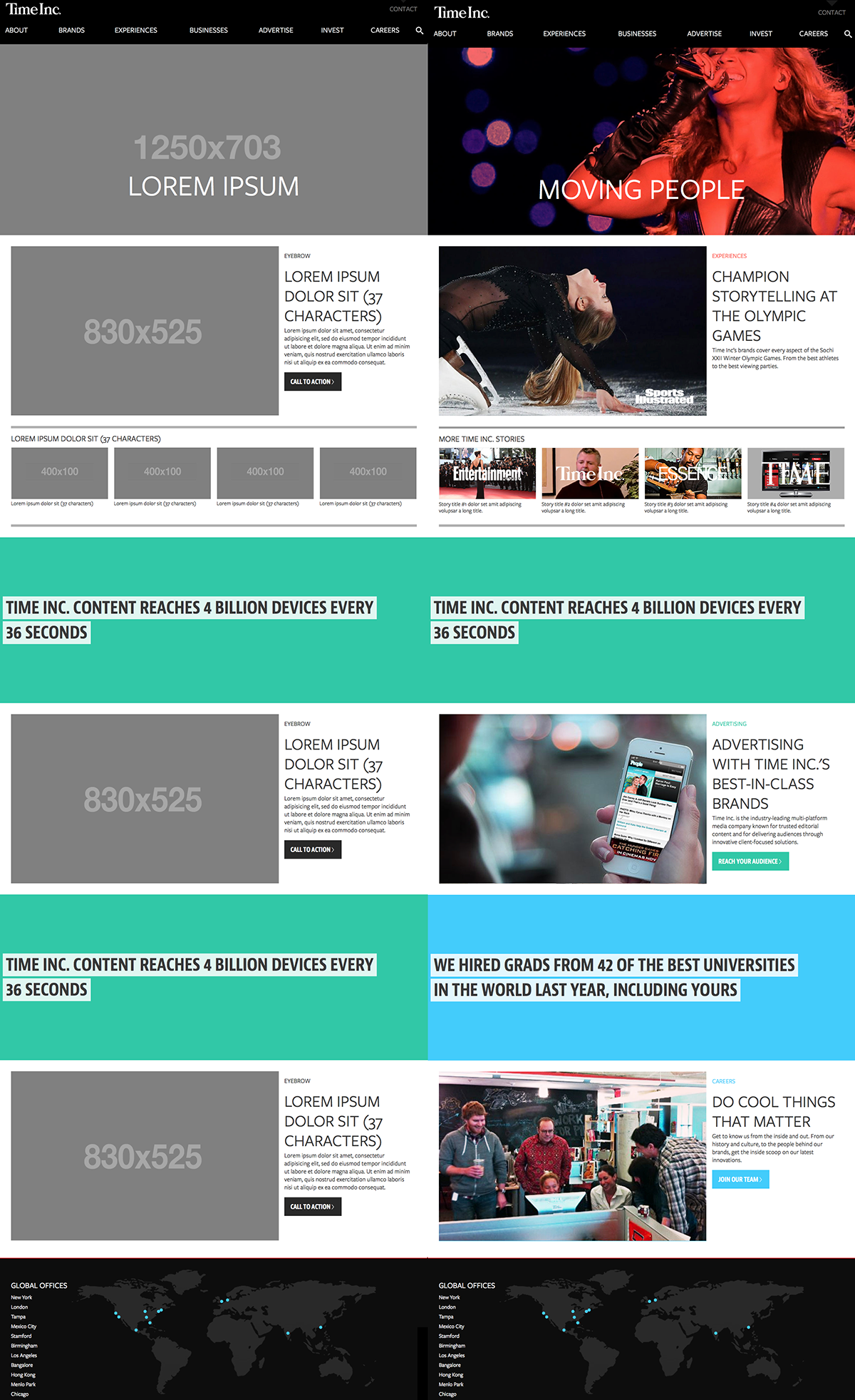
On the left we have the template level, which articulates the content structure of the patterns making up the web page. And on the right we have the page level, where we’re pouring in real representative content to demonstrate what the final UI might look like and test the effectiveness of the design system.
How do we swap dummy content for real content in Pattern Lab? Pattern Lab uses JSON (as well as YAML, Markdown, and other data formats) to define and swap out the dynamic bits of content in our designs.
The default placeholder data is defined in a file called data.json that lives in Pattern Lab’s /source directory. Inside this file we define all the text, image paths, and other dynamic data that will make up our UI. Here’s a small sample from Time Inc.’s data.json file:
"hero" : {
  "headline": "Lorem Ipsum",
  "img": {
    "src": "/images/sample/fpo_hero.png",
    "alt": "Hero Image"
  }
}
For developers, this type of format most likely looks familiar. If you’re not a developer, don’t freak out! Once you look beyond the curly braces and quotes, you’ll see that we’re defining a hero object (for the full-bleed hero area directly below the header) that has a headline value of “Lorem Ipsum”, and an img with a src value of “/images/sample/fpo_hero.png”. We’re simply defining this object’s attributes and providing values for those attributes.
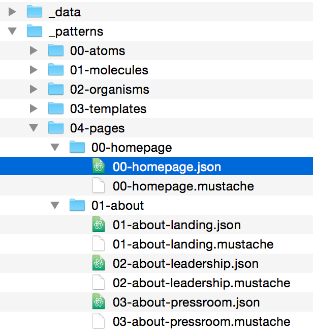
Once those objects are defined, we can then override their attributes at Pattern Lab’s page level. This is accomplished by creating a new JSON file that matches the page pattern name (for Time Inc.’s homepage, we’ll call it 00-homepage.json) inside the /pages directory.
When we open up 00-homepage.json we can override the placeholder data we established earlier. Here’s what that might look like:
"hero" : {
  "headline": "Moving People",
  "img": {
    "src": "/images/hero_beyonce.jpg",
    "alt": "Beyonce"
  }
}
By overriding the default data, the hero headline now reads “Moving People” instead of “Lorem Ipsum.” And instead of pointing to a grayscale for-placement-only (FPO) hero image, we’re now pointing to a picture of Beyoncé located at “/images/hero_beyonce.jpg”.
This process of establishing defaults for dynamic data then replacing them with page-specific content continues for each section of the website. In addition to replacing simple strings like headings, we can also dynamically set variables to true or false, loop through an array of items, and more. We can even dramatically alter the UI with just a few changes to a JSON file, which we’ll talk about next.
Articulating pattern variations with pseudo-patterns
Historically, designers working with static tools have had a tendency to only design best-case scenarios. You know what I’m talking about: the user’s name is Sara Smith and always fits neatly on one line; her profile picture looks like it was clipped out of a magazine; her profile is completely filled out; the two columns of her profile content are exactly the same height.
Of course, these best-case scenarios rarely, if ever, occur in the real world.
To create more robust and resilient designs, we need to concurrently account for the best situations and the worst – and everything in between.
What if the user doesn’t upload a profile picture? What if the user has 87 items in their shopping cart? What if the product has 14 options? What if the blog post title contains 400 characters? What about a returning user? A first-time user? What if the article doesn’t have any comments? What if it has seven layers of nested comments? What if we need to display an urgent message on the dashboard?
Articulating these UI variations in a static design tool is an exercise in tediousness and redundancy, which may explain why they’re rarely designed. But if we want to create systems that address all the variables and realities of our content, we must take those ‘what if’ questions into account.
How do we address all manner of UI variation without exhausting ourselves in the process? Pattern Lab’s pseudo-pattern feature allows us to articulate sometimes wildly different scenarios with just a few changes to our data.
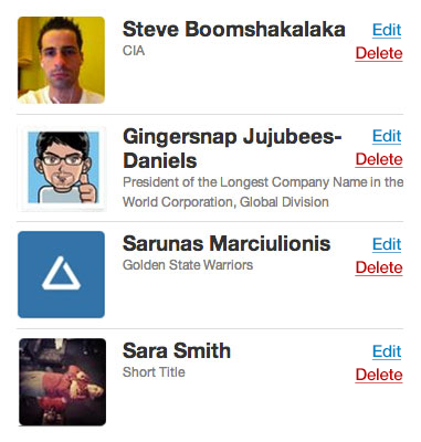
Let’s say we’re making an app whose dashboard displays a list of project collaborators. The UI might look something like this:
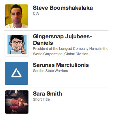
To create the dynamic content inside each of these blocks, we’ll define our list of collaborators as an array inside dashboard.json:
"collaborators" : [
  {
    "img": "/images/sample/avatar1.jpg",
    "name" : "Steve Boomshakalaka",
    "title" : "CIA"
  },
  {
    "img": "/images/sample/avatar2.jpg",
    "name" : "Gingersnap Jujubees-Daniels",
    "title" : "President of the Longest Company Name in the World Corporation, Global Division"
  },
  {
    "img": "/images/sample/avatar3.jpg",
    "name" : "Sarunus Marciulionis",
    "title" : "Golden State Warriors"
  },
  {
    "img": "/images/sample/avatar4.jpg",
    "name" : "Sara Smith",
    "title" : "Short Title"
  }
]
By default, our design assumes the user is a regular user and not an administrator, but what if we wanted to give administrators the ability to manage project collaborators from the dashboard? That UI might look something like this:
To show additional admin edit and delete actions on the dashboard in Pattern Lab, we can create a pseudo-pattern, a new file in the pages folder that looks like this:
dashboard~admin.json
The tilde (~) symbol indicates a pseudo-pattern. dashboard~admin.json will inherit all the data contained in dashboard.json, but also gives us the opportunity to append or override additional data. That means the list of collaborators we defined earlier in dashboard.json is still available, but we can add additional data inside dashboard~admin.json like so:
"isAdmin" : true
We’re defining a variable called isAdmin and setting it to true. We can now use that to conditionally include the additional actions inside the block pattern.
<div class="block">
  <img src="{{ img }}" alt="{{ name }}" />
  <h3>{{ name }}</h3>
  <h4>{{ title }}</h4>
  {{# isAdmin }}
  {{> molecules-block-actions }}
  {{/ isAdmin }}
</div>
The first few lines are pulling in the img, name, and title we defined in dashboard.json. But pay close attention to what’s wrapped in the isAdmin Mustache section. What we’re saying here is: if isAdmin is set to true, include a molecule pattern called block-actions. The block-actions pattern contains the edit and delete buttons, and will only display if isAdmin is set to true (or anything besides false). In our default dashboard.json, isAdmin isn’t set, so the extra actions won’t display. In dashboard~admin.json, we’re setting isAdmin to true so the extra actions will display. You can extend this technique to dramatically alter the entire UI (like altering the primary navigation, showing additional panels on the dashboard, adding extra controls, and so on) just by changing a single variable. Powerful stuff, indeed.
Whew. If you’ve made it this far, congratulations! You now know how to add and manipulate dynamic data in Pattern Lab. Pattern Lab’s ability to design with dynamic data provides some crucial benefits:
- Creates a clear separation between structure and content. A pattern’s structure and its content very much influence each other. However, resilient design systems strive to establish agnostic, flexible patterns that can contain a variety of content. Decoupling pattern structure and data allows us to keep things DRY (which, again, stands for don’t repeat yourself) and make changes to content without affecting the pattern structure. Likewise, we’re able to make changes to a pattern without having to update every instance of that pattern simply because each instance contains different data. This separation results in huge savings in both time and effort.
- Establishes an ad hoc CMS. Establishing default and page-specific data serves as an ad hoc content management system. As mentioned earlier, static design tools aren’t well equipped to handle dynamic data, but it’s also overkill to install WordPress, Drupal, or some other CMS just to demonstrate UI variations. Pattern Lab strikes a balance as it allows teams to work with dynamic data but doesn’t require setting up any crazy MySQL databases.
- Serves as a blueprint for back-end developers responsible for integrating the front-end UI into a real content management system. Back-end developers can look at the UI created in Pattern Lab, understand which bits are static and dynamic, then translate that into the back-end system.
- Allows writers, content people, designers, and other non-developers to contribute to the living, breathing design system. As a front-end developer, I can’t count the number of times I’ve had to fix typos, swap in new images, translate copy decks, and make other content-related edits to front-end code. It’s death by a million paper cuts, and I’m sure most developers would agree that making minor copy changes isn’t an effective use of their time. By separating structure and data, Pattern Lab enables non-developer team members to safely manage the content-related aspects of the design, freeing up developers to focus on building the design system’s structure.
We’ve now covered Pattern Lab’s core functionality, but we’re not done yet! Next we’ll cover a few additional features that should be considered, irrespective of the tool you use to create your pattern library.
Viewport tools for flexible patterns
The multitude of devices now accessing the web has forced designers to re-embrace the intrinsic fluidity of the medium. Thankfully, techniques like responsive web design allow us to create layouts that look and function beautifully on any screen.
It’s a no-brainer that we need to establish flexible UI patterns if we want to create responsive designs, but creating fluid patterns has additional advantages. The more fluid a UI component is, the more resilient and versatile it becomes. Imagine being able to take a component — let’s say a photo gallery slider — and plunk it anywhere we need it. Sometimes we may need it to be a full-bleed element occupying the entire viewport. Other times we may need to include it in the context of an article. And still other times we may want to include it in the sidebar. The dream is to build our components fluidly and they’ll adapt their styles and functionality to fit whatever containers we put them into.
Indeed, this is the promise of container queries. Container queries let elements adapt based on their parent containers rather than the entire viewport, which is how we manipulate elements using media queries at the moment. While still being developed as a native browser capability, container queries will allow us pattern-crazed designers and developers to easily create and deploy fluid UI systems.
Between responsive design, container queries, and good ol’-fashioned common sense, we now understand why it’s imperative to create flexible UI patterns. But how do we do that? And how can our pattern library tools help us think and act flexibly?
Many early responsive design testing tools focused on viewing designs on popular mobile device widths, such as 320px (an iPhone 4 in portrait mode), 480px (an iPhone 4 in landscape mode), 768px (an iPad in portrait mode), and so on. But, of course, the web is much more diverse than a mobile view, a tablet view, and a desktop view. To help designers better consider the entire resolution spectrum when testing their responsive designs, I created a tool called ish.
The tool is called ish. because selecting the small button results in a small-ish viewport. Selecting it again provides a different small-ish viewport. Selecting the medium button gives you a medium-ish viewport. And the large button results in a—wait for it—large-ish viewport. These randomized values help designers and developers better consider the entire resolution spectrum rather than a handful of popular device dimensions.
Ish. is baked into Pattern Lab, which means we can view our UIs and their underlying patterns across the entire resolution spectrum.
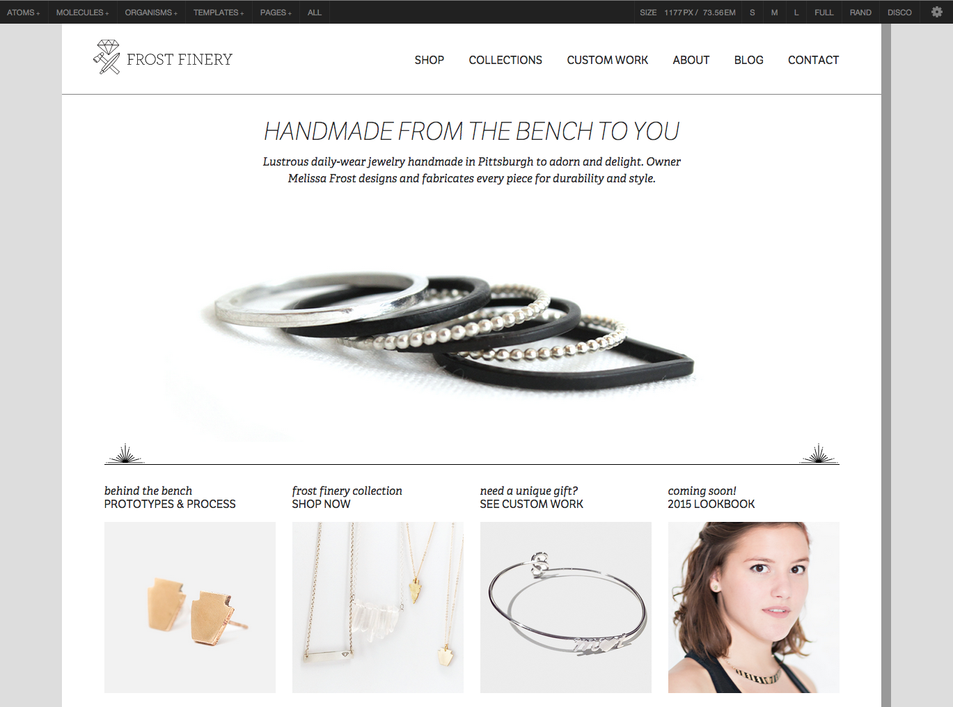
While ish. helps designers and developers uncover bugs along the viewport continuum, I’ve found it to be more helpful as a client and colleague education tool. By building a device-agnostic viewport resizing tool directly into the pattern library, clients and colleagues can come to appreciate the fact that their design system should look and function well no matter the viewport size.
A look under the hood with code view
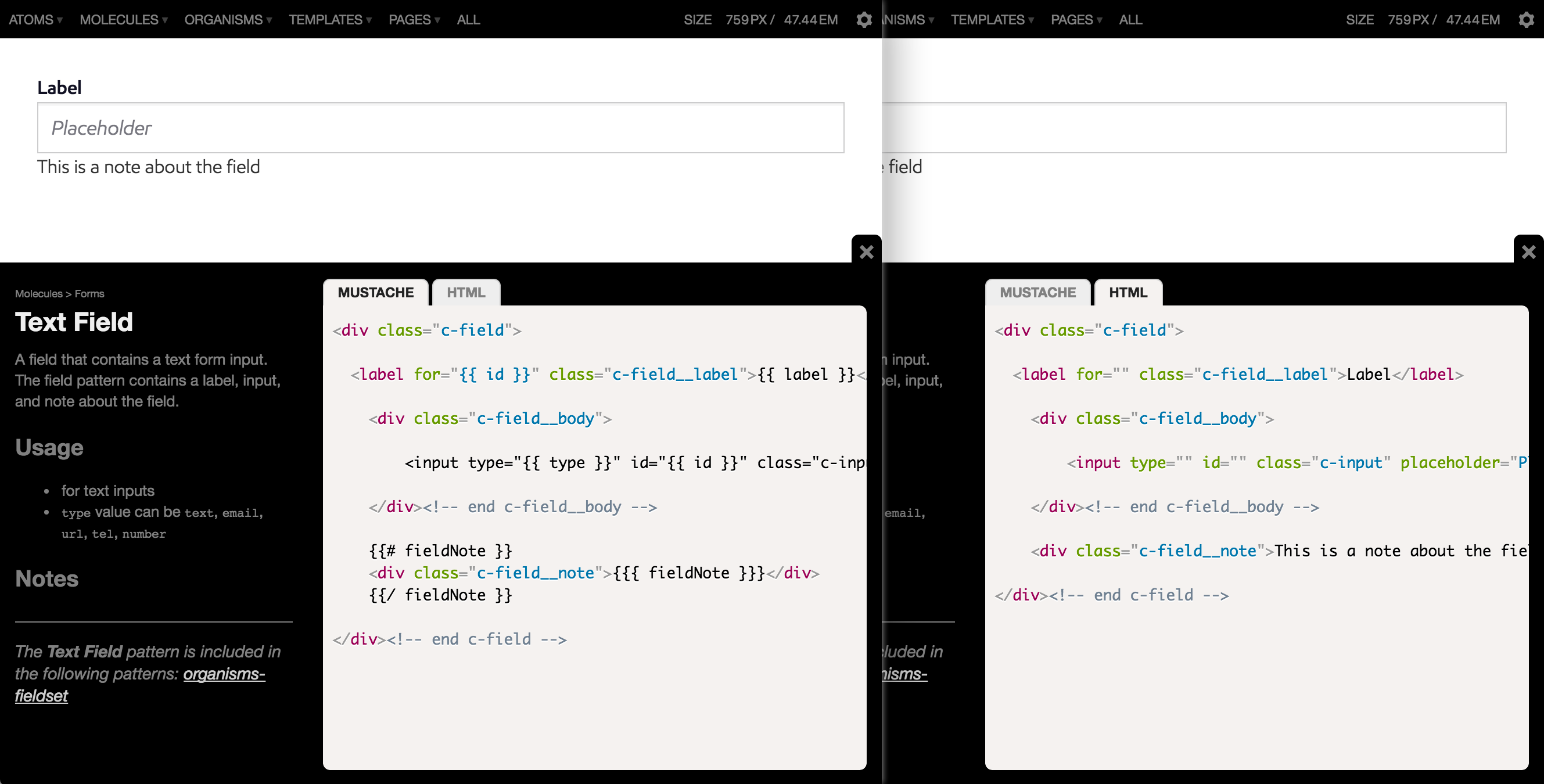
A common pattern library feature is the ability to peek under the hood and view the underlying code that makes up a particular component. Exposing a UI pattern’s code speeds up development time (I love copying and pasting as much as the next coder) and helps team leaders enforce code syntax and style conventions. This becomes especially rewarding when a ton of developers are working on an organization’s codebase.
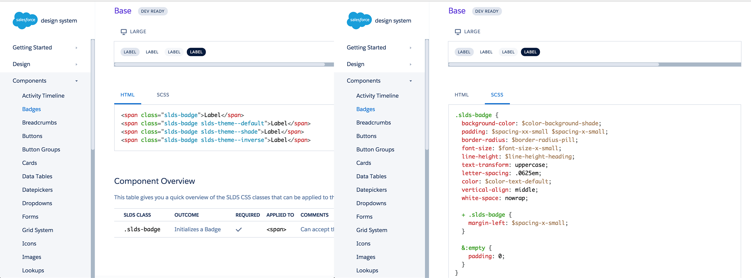
The types of code to be highlighted in a pattern library naturally vary from organization to organization, in order to meet the requirements of the vast array of environments, technologies, and conventions used. Most pattern libraries out there in the wild demonstrate a pattern’s underlying HTML, while others also include pattern-specific CSS and JavaScript. Salesforce’s Lightning design system, for example, shows a pattern’s HTML as well as all the (S)CSS pertaining to that pattern.
Including front-end code leads to authors writing it more consistently, but that doesn’t guarantee perfection. There’s still room for developers to go rogue and write sloppy, incongruent code—which is why some organizations have gone above and beyond to establish incredibly sophisticated design systems. Companies like Lonely Planet have achieved the holy grail of pattern libraries, which is to say their pattern library and production environment are perfectly in sync. We’ll discuss the holy grail in more detail in chapter 5, but it’s worth bringing up in this section to demonstrate how that affects the code exposed in the context of a pattern library. Rather than offering HTML and CSS, Lonely Planet’s Rizzo style guide surfaces the include code for teams to pull in the appropriate UI component.
This setup allows the core development team to maintain a single source of truth for all patterns’ front-end code. For developers to get up and running, the pattern library needs only provide the code to include a particular pattern.
Pattern Lab provides the ability to view both a pattern’s underlying HTML and the template code used to generate the HTML. It can also be extended to showcase accompanying CSS and JavaScript code.
Ultimately, whichever pattern library tool you decide to use should have some form of code view. Perhaps more importantly, the pattern libraries you create should showcase the types of code that enable you and your development team to be as effective as possible.
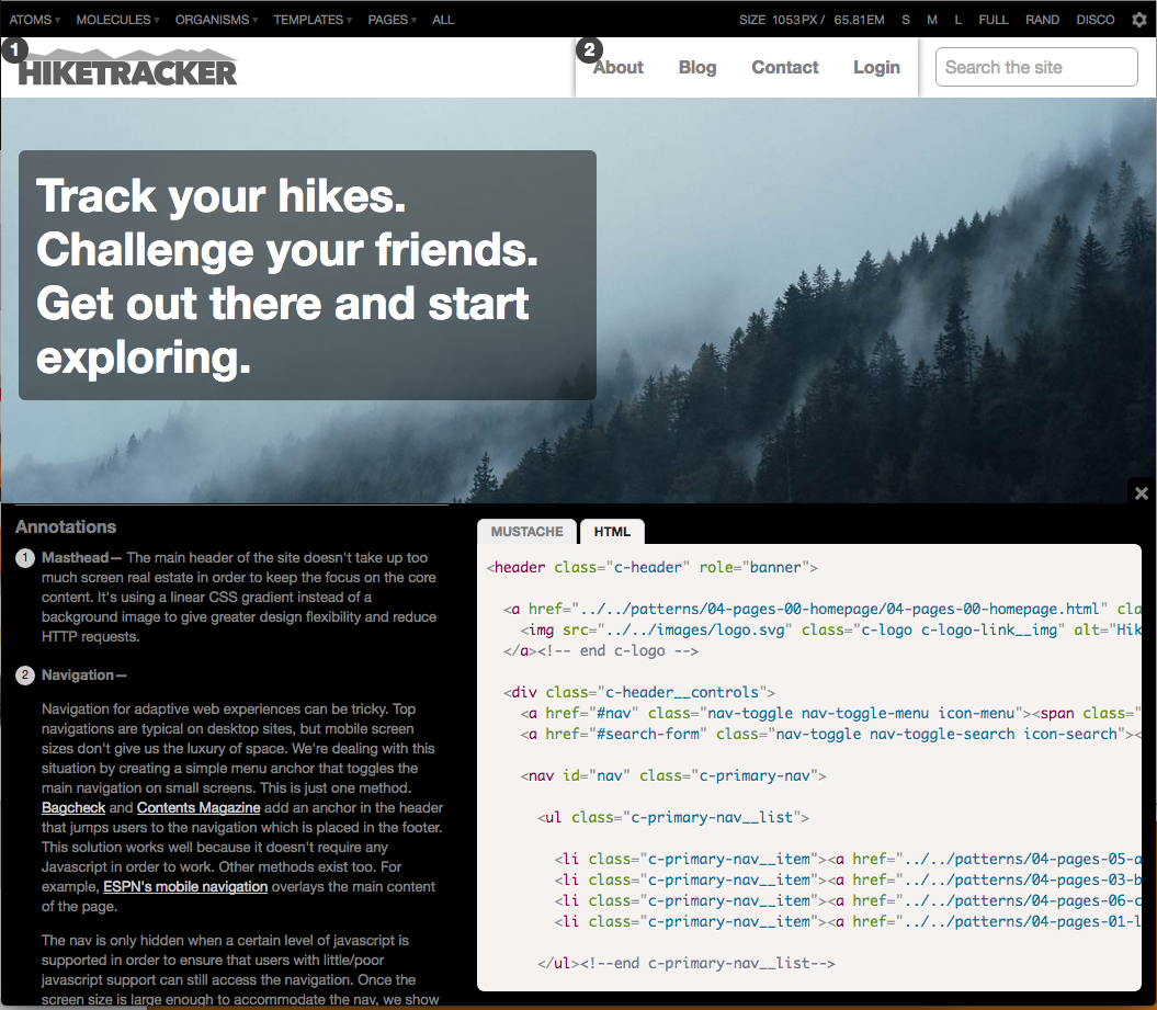
Living documentation and annotations
In a traditional siloed design process, it’s typical to see lengthy wireframe and spec documents created, debated, and approved. These documents usually take the form of gigantic PDFs, which is unfortunate considering they often contain all sorts of valuable insights, instructions, and documentation about the design system. Sadly, these bulky artifacts are often thrown into a (virtual) trash can by the time the project makes its way into production.
This shouldn’t be the case. A UI’s documentation should contain insights from every discipline involved in creating it, and—this is key—should be baked into the living, breathing design system. Effective pattern libraries carve out a space to define and describe UI components, articulating considerations ranging from accessibility to performance to aesthetics and beyond.
Pattern Lab provides several ways to add pattern descriptions and annotations to a design system. Pattern descriptions can be added by creating a Markdown file that corresponds to the name of a pattern (e.g. pattern-name.md), which will show the pattern description in the library list view.
Pattern Lab also provides a (dare I say) cool feature that enables you to attach annotations to any UI element and view those annotations in the context of the living, breathing design. When annotations are switched on, each annotated element receives a number which, when clicked, jumps you to the corresponding annotation. This allows teams to view pattern considerations within the context of the full UI. Pretty neat!
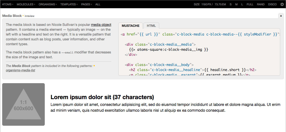
Providing context with pattern lineage
When looking at various patterns in a library, I’ve found myself wondering, “Great, but where is this component actually used?” Defining and describing pattern characteristics is one thing, but there’s an opportunity to provide additional contextual information about your UI patterns.
Thanks to the Russian nesting doll include approach described earlier, Pattern Lab can display what patterns make up any given component, and also show where those patterns are employed in the design system.
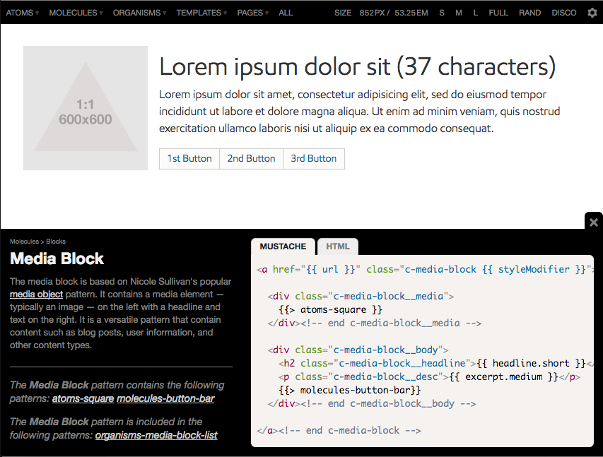
In the example above, we have a molecule pattern called media-block, which contains an image, headline, text, and a group of buttons. Looking at the pattern’s lineage, we can see it contains a pattern called atoms-square, which is the thumbnail-sized image, as well as molecules-button-bar, which is the group of buttons. We can also see where exactly this pattern gets used: the media-block-list organism.
This contextual information is amazingly helpful for designers and developers; I know I use the lineage feature all the time in my own workflow. Let’s say we wanted to make changes to a particular pattern, like doubling the size of an image or adding an additional element: we’d immediately know which patterns and templates would need to be retested and QA’d to ensure nothing breaks with the changes. The lineage feature also helps point out redundant and underused patterns so teams can weed them out of the pattern library as the launch date gets closer.
To each their own
So there you have it. Pattern Lab provides several helpful features for teams to create deliberate, thoughtful design systems. But as I mentioned before, no single tool is going to be perfect for everyone and every situation. There are a ton of great tools out there to help you create effective pattern libraries, and the tools you decide on will undoubtedly be influenced by your organization’s environment, technologies, workflow, and culture.
When choosing tools to create your pattern library, you should keep your eyes open for these qualities and features of effective pattern libraries:
- Providing pattern descriptions and annotations.
- Showcasing the relevant pattern HTML, templating, CSS, and/or JavaScript code.
- Viewing patterns across the entire resolution spectrum.
- The ability to showcase pattern variations, such as active or disabled tabs.
- The ability to dynamically add real representative content into the patterns’ structures.
- Providing contextual information, like which patterns make up a particular component, as well as where that component is used.
At the end of the day, it’s not about the tools we use to create pattern libraries, but rather how we use them. Creating and maintaining an effective design system means dramatically changing your organization’s culture, processes, and workflows. If that sounds hard to you, it’s because it is. But fear not! The rest of the book will detail the entire process of creating and maintaining a successful design system to set your organization up for long-term success.