A long, long time ago, there were these things called books. Remember them? These contraptions were heavy and bulky and made from the pulp of dead trees. Inside these books were things called pages. You turned them, and they cut your fingers.
Awful things. I’m so glad these book things with their razor-sharp pages aren’t around anymore.
Oh, wait…
Our paginated past
The page has been with us for a long time now. A few millennia, actually. The first books were thick slabs of clay created about 4,000 years ago, soon replaced by scrolls as the preferred way to consume the written word. And while reading technology has come a long way – from papyrus to parchment to paperback to pixels – the concept of the page holds strong to this day.
The page metaphor has been baked into the lexicon of the web since the very beginning. Tim Berners-Lee invented the World Wide Web so that he, his colleagues at CERN, and other academics could easily share and link together their world of documents. This document-based, academic genesis of the web is why the concept of the page is so deeply ingrained in the vocabulary of the internet.
So what?
As we’ll discuss throughout this book, the way things are named very much impacts how they’re perceived and utilized. Thinking of the web as pages has real ramifications on how people interact with web experiences, and influences how we go about creating web interfaces.
From the beginning, the page metaphor provided users with a familiar language with which to navigate this brave new World Wide Web. Concepts like bookmarking and pagination helped new web users explore and eventually master an entirely new medium using conventions they were already comfortable with.
The page was – and continues to be – a very visible and helpful metaphor for the users of the web. It also has a profound influence on how web experiences are created.
In the early days of the web, companies looking to get online simply translated their printed materials onto their websites. But even though these brochure websites offered a very one-dimensional perspective of what the web could offer, viewing websites as digital representations of the printed page was easy for creators to wrap their heads around.
But we’re now 25 years into this new medium, and this once necessary figure of speech has overstayed its welcome. Unfortunately, the page metaphor continues to run deep with respect to how we scope and execute our web projects. Here are just a few examples I hear on a regular basis:
“We’re a startup looking to launch a five-page website this October…”
“Brad, how long will the homepage take to build?”
“How are we ever going to redesign this university website that contains over 30,000 pages?!”
All of the statements above make the fundamental mistake of assuming a page is a uniform, isolated, quantifiable thing. The reality is that the web is a fluid, interactive, interdependent medium. As soon as we come to terms with this fact, the notion of the page quickly erodes as a useful means to scope and create web experiences.
How long will a homepage take to build? Well, that sort of depends on what’s on it, right? Maybe the homepage simply consists of a tagline and a background image, which means it could be done by lunch. Or maybe it’s chock-full of carousels, dynamic forms, and third-party integrations. In that case, maybe the homepage will take several months to complete.
As for the 30,000-page university website, it might be tempting to declare, “Thousands of pages?! Wow, that sounds challenging!” But in reality, those 30,000 pages may consist of three content types and two overarching layouts.
Ultimately, a project’s level of effort is much better determined by the functionality and components contained within those pages, rather than on the quantity of pages themselves.
The page metaphor has served its purpose helping users familiarize themselves with the web, and provided creators with the necessary transitional language with which to create for a brand new medium. But to build thoughtful interfaces meant to be served to a multitude of connected devices, the time has come for us to evolve beyond the page.
Tearing up the page
Thankfully, the web community is hard at work establishing principles and practices to help us effectively talk about and create for the web. And there’s one concept that keeps popping up in every conversation about how to make successful web experiences: modularity.
Modularity predates the web by a long shot. The Industrial Revolution brought about interchangeable parts and Henry Ford’s assembly line forever transformed the automobile manufacturing process. The earliest cars and components were individually crafted, which led to many safety and maintainability nightmares. Ford broke the automobile down into its component parts and modularized the assembly process. The results spoke for themselves: more uniform, more reliable, safer cars rolled out of the factory, and in record time to boot.
As the machine age became the computer age, computer scientists began practicing object-oriented programming and establishing important modular concepts like separation of concerns and the single responsibility principle. It is from this world that the World Wide Web was born, so it’s no surprise that modular design quickly became a design principle for the architecture of the web.
Slowly, but surely, these concepts found their way into web designers’ workflows. In the early 2000s we saw the introduction of libraries like YUI and jQuery UI that provided developers with a toolkit of widgets and patterns to create more consistent user interfaces.
If modularity has been around for such a long time, why are we talking about it now?
The short answer is that modularity matters more than ever. Right now, our entire industry is drowning in a sea of devices, viewport sizes, and online environments. And things aren’t slowing down anytime soon.
Disruption will only accelerate. The quantity and diversity of connected devices — many of which we haven’t imagined yet — will explode, as will the quantity and diversity of the people around the world who use them. Our existing standards, workflows, and infrastructure won’t hold up. Today’s onslaught of devices is already pushing them to the breaking point. They can’t withstand what’s ahead. The Future-Friendly manifesto

Like it or not, this multi-device universe is our reality. It was hard enough to get our web pages to display consistently in a handful of desktop browsers, but we’re now tasked with ensuring our web experiences look and function beautifully on a dizzying array of smartphones, tablets, phablets, netbooks, notebooks, desktops, TVs, game consoles, and more.
To address this reality while maintaining our sanity, it’s absolutely necessary for us to take a step back and break these giant responsibilities into smaller, more manageable chunks.
And that’s exactly what folks are doing. The spirit of modularity is weaving its way into every aspect of the web creation process and having profound effects on organizations’ strategy, process, content, design, and development.
A manageable strategy
Every organization is finally realizing that bulldozing their entire website and replacing it with a New-And-Shiny™ website every three to eight years isn’t (and never was) an optimal solution.
Out with the old! In with the new! It’s certainly an attractive prospect. But even before the launch party confetti is swept up, the calls start coming in. “You moved my cheese!” cry the users, who spent years learning the previous interface and functionality.
When massive redesigns launch with significant changes to the experience, users get knocked down what Jared Spool calls the “Magic Escalator of Acquired Knowledge”. Huge redesigns are a jolt to the system, and newly frustrated users have to spend a great deal of time and energy relearning the experience in order to slowly climb back up that escalator of acquired knowledge.
In addition to disorienting users, these monolithic redesigns don’t get to the organizational root of the problem. Without a fundamental change in process, history is bound to repeat itself, and what’s New-And-Shiny™ today becomes Old-And-Crusty™ tomorrow. The cycle repeats itself as companies push off minor updates until the next big redesign, ultimately paralyzing themselves and frustrating users in the process.
Thankfully, even massive organizations are taking cues from the smaller, leaner startup world and striving to get things out the door quicker. By creating minimum viable products and shipping often to iteratively improve the experience, organizations are able to better address user feedback and keep up with the ever-shifting web landscape.
Moving away from Ron Popeil-esque, set-it-and-forget-it redesigns requires deliberate changes in organizational structure and workflow. Which is a heck of a lot easier said than done.
An iterative process
If I had a quarter for every time I heard some stakeholder declare “We’re trying to be more agile,” I’d be orbiting the earth in my private spacecraft instead of writing this book.
Wanting to be more agile is commendable. But agile is a loaded term, with big differences between capital-A Agile and lowercase-a agile. Capital-A Agile is a specific methodology for software development, equipped with a manifesto and accompanying frameworks like Scrum and Lean.
Lowercase-a agile is more of an informal desire to create an efficient process. This desire may certainly involve adopting general principles from capital-A Agile, but it may not involve adopting the Agile process in its entirety. Project manager Brett Harned explains:
We want to be more agile; we’re embracing change, continuing improvement, being as flexible as possible, and adapting as we see fit. The thing is, we won’t ever truly be Agile, as the Manifesto states. That’s okay, as long as we say what we will be. Brett Harned
Organizational structure, client relations, personalities, and so on all play major roles in determining a project’s process. The trick is to find the process that works best for you, your organizational constraints and opportunities.
Even though it may be impossible to adopt a truly Agile process, it’s still a sound idea to work in cross-disciplinary teams, get into the final environment faster, ship early and often, and break bigger tasks into smaller components. In chapter 4, we’ll detail how to establish an effective pattern-based workflow.
Modularizing content: I’m on Team Chunk
Get your content ready to go anywhere, because it’s going to go everywhere. For A Future-Friendly Web
Publishing content for the Web used to be a fairly straightforward endeavor, as the desktop web was the only game in town. Oh, how things have changed. Today, our content is consumed by a whole slew of smartphones, dumb phones, netbooks, notebooks, tablets, e-readers, smartwatches, TVs, game consoles, digital signage, car dashboards, and more.
To properly address this increasingly diverse and eclectic digital landscape, we need to dramatically overhaul our perception of content and the tools we use to manage it.
In the future, what I believe is that we are going to have better content management and content publishing tools. We are going to have ways to take well-structured content, well-designed chunks of content that we can then figure out how we want to restructure and publish and display in a way that’s going to be right for the appropriate platform. Karen McGrane
Thankfully, this future is starting to take shape. Organizations are recognizing the need to create modularized content to better reach their audience wherever they may be. And content management systems are evolving beyond their web publishing platform roots into tools that can elegantly create and maintain modular content. While sophisticated content management systems have existed for years in the form of custom solutions like NPR’s COPE (Create Once, Publish Everywhere) platform, smart modular thinking is making its way into mainstream content management systems.
Classy code
Modularity has long been a staple principle in the world of computer science, as we discussed earlier. While this principle existed long before the web was invented, it has taken some time for modularity to become engrained in the minds and hearts of web developers.
Despite being around since 1995, JavaScript, the programming language of the web, first had to endure some growing pains to mature into the capable, respected language it is today. Now that JavaScript has grown up, developers can apply those tried-and-true computer science principles to their web development workflows. As a result, we’re seeing folks develop sophisticated JavaScript patterns and architectures.
Applying modular programming principles to JavaScript is a bit of a no-brainer, since JavaScript is itself a programming language. But object-oriented thinking is weaving its way into other aspects of the web as well, including CSS, the styling language of the web. Methodologies like OOCSS, SMACSS, and BEM have cropped up to help web designers create and maintain modular CSS architectures.
Visually repaired
Not only is modularity infiltrating the code side of style on the web, it’s revolutionizing how visual designers approach modern web design.
As the number of viewports and environments proliferate, it’s become untenable to produce static mockups of every page of a web experience. As Stephen Hay quipped, presenting fully baked Photoshop comps “is the most effective way to show your clients what their website will never look like.”
That’s not to say static design tools like Photoshop and Sketch aren’t important. Far from it. But it’s the way we use these tools that has changed dramatically. While creating hundreds of full-on comps isn’t realistic, these static tools excel at providing a playground to establish what Andy Clarke calls “design atmosphere”:
Atmosphere describes the feelings we get that are evoked by colour, texture and typography. You might already think of atmosphere in different terms. You might call it “feel”, “mood” or even “visual identity.” Whatever words you choose, the atmosphere of a design doesn’t depend on layout. It’s independent of arrangement and visual placement. It will be seen, or felt, at every screen size and on every device. Andy Clarke
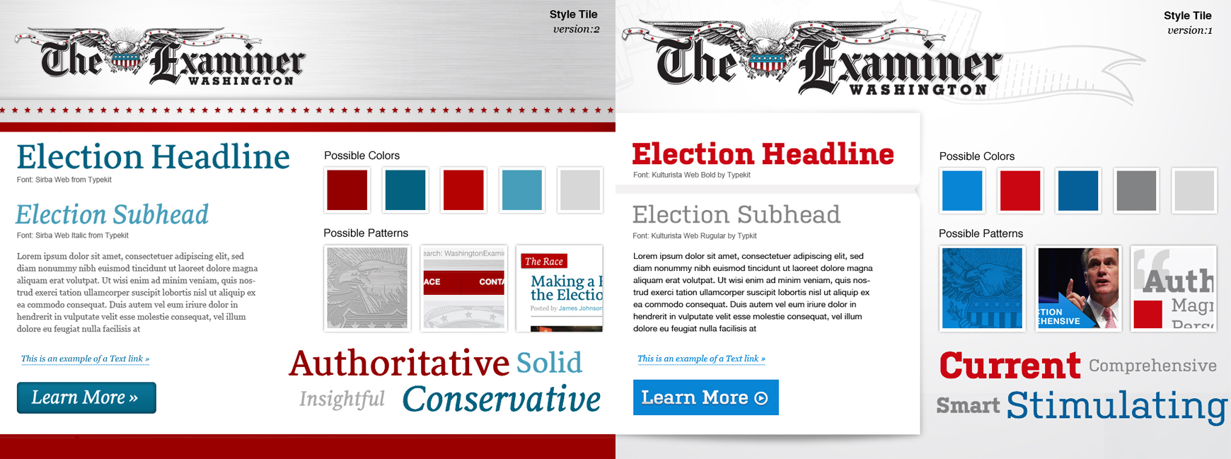
Establishing design atmosphere early is critical to a project’s success, which is why designers have found ways to facilitate these important conversations without having to generate full mockups. Designer Samantha Warren developed design artifacts called style tiles, which demonstrate color, type, and texture explorations in a nice encapsulated one-pager. Designer Dan Mall built on Samantha’s idea with a concept called element collages, which demonstrate design atmosphere explorations in an exploded collage of interface elements.
By breaking visual explorations into smaller chunks, designers save time and effort while avoiding presenting unrealistic, premature layouts to clients. More importantly, these approaches shift stakeholders away from simply reacting to a pretty picture, and instead facilitate crucial conversations about overall design direction and how they relate to the project’s goals. We’ll discuss these concepts in more detail in chapter 4, but suffice it to say the visual design workflow is changing in a big way!
Systematic UI design
We’re not designing pages, we’re designing systems of components. Stephen Hay
What is an interface made of? What are our Lego bricks? What are our Subway sandwich pieces that we combine into millions of delicious combinations? It’s these questions that we’ve been asking ourselves more and more now that we’re sending our interfaces to more and more places.
A few years ago Ethan Marcotte introduced us to the idea of responsive web design and its three core tenets: fluid grids, flexible media, and CSS media queries. These three ingredients provided a much-needed foundation for designers to create flexible layouts that smartly adapt to any screen size. Perhaps more importantly, responsive design helped get designers excited about creating thoughtful, adaptable, multi-device web experiences.
As designers quickly discovered, creating multi-device web experiences involves a lot more than creating squishy pages. Each individual piece of an interface contains its own unique challenges and opportunities in order for it to look and function beautifully across many screen sizes and environments.
How can we present primary navigation – typically displayed as a horizontal list on large screens – in a thoughtful way on smaller screens? How do lightboxes, breadcrumbs, and carousels translate to smaller viewports and alternate input types? It’s these questions that led me to create This Is Responsive, a showcase of responsive patterns that demonstrate the various ways a particular component could be executed in a responsive environment.
While This Is Responsive is successful at articulating how these interface patterns can scale across screen sizes and environments, it’s still up to designers and developers to put these patterns into action. And as it turns out, that’s a lot of work.
UI frameworks, in theory and in practice
Designers and developers are already strapped for time and resources, and they’re now being tasked with making interfaces that look and function beautifully in any environment. That’s a very tall order.
This need to address growing device diversity while still sanely getting projects out the door has given rise to front-end frameworks like Foundation by Zurb and Bootstrap. These user interface frameworks provide designers with a collection of preassembled HTML patterns, CSS styles, and JavaScript to add functionality to interactive components like dropdowns and carousels. In essence, these frameworks are handy tool kits for quickly assembling interfaces.
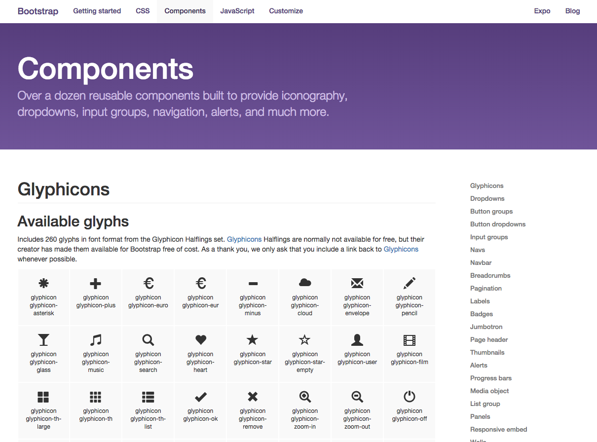
And boy are these things popular. As I’m writing this, Bootstrap is the most popular repository on the code-sharing site GitHub, with over 77,000 stars and 30,000 forks. These frameworks’ popularity is a testament to the fact that designers and developers are seeking solid ground to stand on in this ever-complex web landscape.
One of the most attractive aspects of these frameworks is speed. Frameworks like Bootstrap allow designers to get ideas off the ground quickly, rapidly create prototypes, and launch sites sooner. Because the patterns provided by a tool kit are already cross-browser tested, developers can spend their time on more important tasks rather than beating their heads against a table testing some archaic version of Internet Explorer. And in case designers do get stuck, these frameworks’ communities can provide helpful support and advice.
For freelancers, this increase in speed might mean they can take on an extra project or three, yielding more financial stability for the year. And in the startup world – a place where Bootstrap is omnipresent – minimum viable products can launch sooner, leading to faster answers regarding the products’ viability.
So frameworks like Bootstrap are insanely popular design systems that provide well-tested components, resulting in consistent designs and faster launches. What’s not to love? Well, like most everything in life, there are cons right there alongside the pros.
Trouble in framework paradise
When I was a kid, I’d watch sci-fi movies and TV shows with a strange fascination. There was one question I could never quite shake: why are they all dressed the same?
I could only guess that given enough time, we solve fashion. “Say, these jumpsuits are pretty snazzy, and comfortable too! Let’s just all wear these from now on.” “Sounds good to me!”
Of course, that’s not how human beings work. We all have different tastes, goals, and desires. Variety, as they say, is the spice of life, and fashion, music, and design reflect our diverse nature. Yet on the web we tend to fall into the trap of wanting everyone to do things the same way. “Why don’t all browsers just standardize on WebKit?” “Why can’t device manufacturers just use the same screen sizes?” “Always use jQuery!” “Never use jQuery!” “Just use frameworks!” “Never use frameworks!”
Just like the real world, the diverse needs, goals, and desires of web projects lead to a myriad of different solutions. Of course, there’s a time and place for everything, and designers and developers need the discernment to know which tools to use and when.
Front-end frameworks are tools that provide a specific solution and a particular look and feel. While those solutions help speed up development, the resulting experiences end up resembling those sci-fi jumpsuits. When everyone uses the same buttons, grids, dropdowns, and components, things naturally start to look the same. If Nike, Adidas, Puma, and Reebok were to redesign their respective sites using Bootstrap, they would look substantially similar. That’s certainly not what these brands are going for. Sure, each brand can modify and extend the default look and feel, but after a while customization means fighting the framework’s given structure, style, and functionality.
In addition to look-alike issues, these frameworks can add unnecessary bloat to an experience. It’s fantastic that frameworks provide plenty of prebuilt components and functionality, but a large percentage of designers and developers won’t adopt every aspect of the framework. Unfortunately, users still have to download the framework’s unused CSS and JavaScript, resulting in slower page loads and frustration.
On the flip side of that coin, frameworks might not go far enough, leading to developers needing to create a substantial amount of custom code to achieve their projects’ goals. At some point, a threshold is crossed where the initial benefits of using a framework–namely development speed–are outweighed by the time spent modifying, extending, and fixing the framework.
And then there’s the issue with naming. Using a framework means subscribing to someone else’s structure, naming, and style conventions. Of course, it’s important to establish a useful front-end lexicon, but what makes sense for an organization might not be what comes out of a framework’s box. I, for one, would balk at the idea of using Bootstrap’s default component for a featured content area they call a “jumbotron”. How a framework’s naming conventions jive with an existing codebase and workflow should be properly discussed before jumping on board the framework train.
Now that we’ve put frameworks through the wringer, it’s important to take a step back and recognize that conceptually these frameworks are very much on point. It’s an excellent idea to work with a design tool kit that promotes consistency and speeds up development time. While discussing the redesign of Microsoft’s homepage by Austin-based web shop Paravel, developer Dave Rupert stressed the importance of creating and delivering a design system to their client. Dave wonderfully articulated that it’s not necessarily about using Bootstrap for every client, but rather creating “tiny Bootstraps for every client.”
Responsive deliverables should look a lot like fully-functioning Twitter Bootstrap-style systems custom tailored for your clients’ needs. These living code samples are self-documenting style guides that extend to accommodate a client’s needs as well as the needs of the ever-evolving multi-device web. Dave Rupert
It’s not just about using a design system, it’s about creating your system.
Design systems save the day
So what do robust design systems look like? What form do they take? How do you create, maintain, and enforce them?
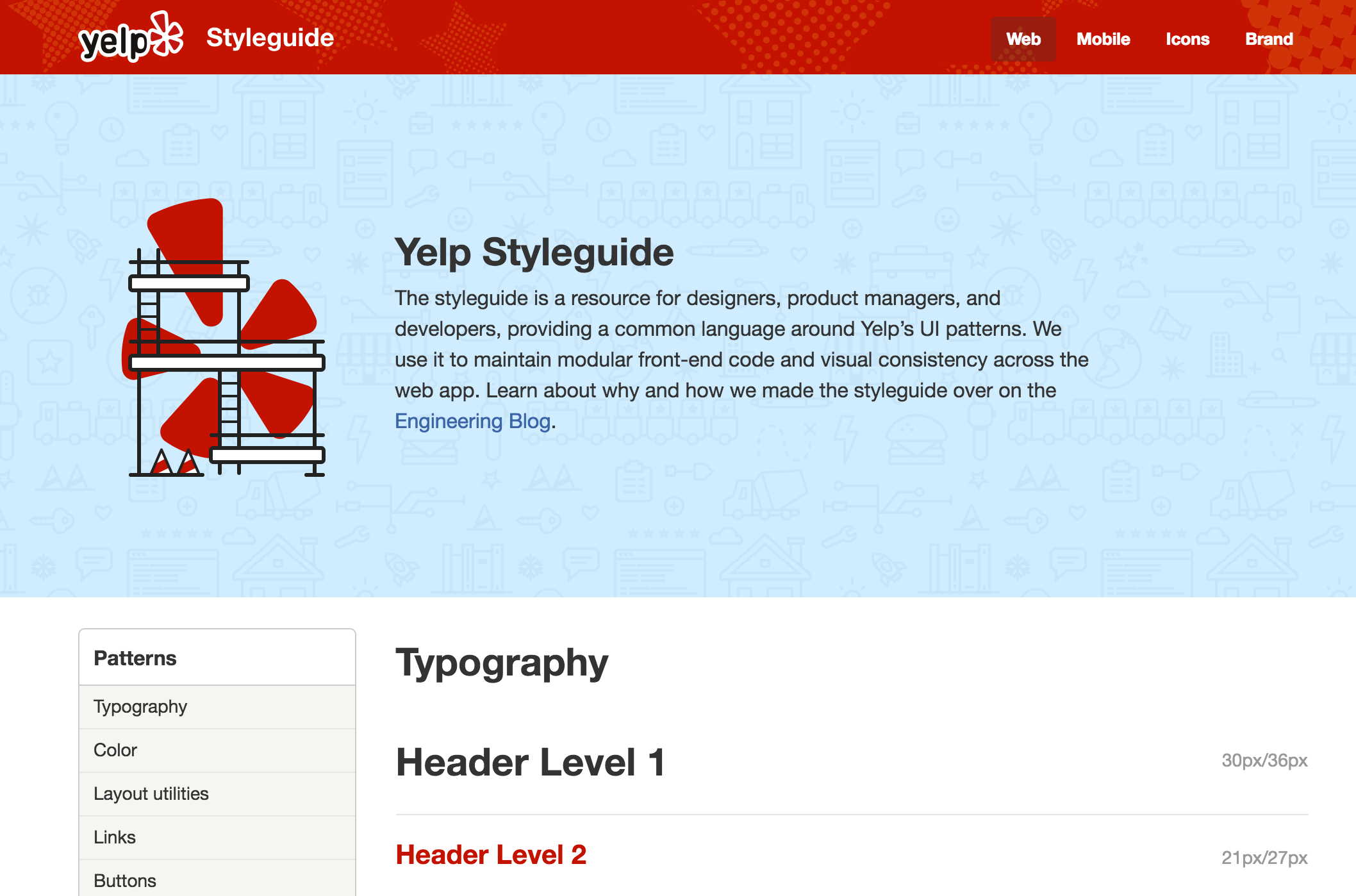
The cornerstones of good design systems are style guides, which document and organize design materials while providing guidelines, usage, and guardrails.
As it happens, there are many flavors of style guides, including documentation for brand identity, writing, voice and tone, code, design language, and user interface patterns. This book won’t detail every category of style guide, but it’s important to take a look at each to better understand how each style guide influences the others, and how style guides for the web fit into a larger ecosystem.
Brand identity
Brand identity guidelines define the assets and materials that make a company unique. Logos, typography, color palettes, messaging (such as mission statements and taglines), collateral (such as business card and PowerPoint templates), and more are aggregated and described in brand identity guidelines.
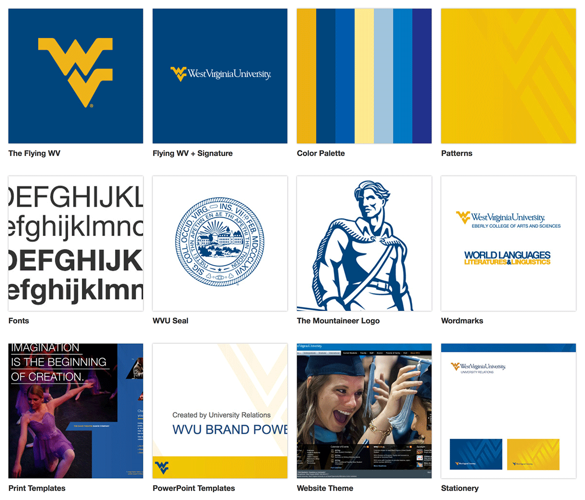
It’s essential for a brand to present itself in a cohesive manner across an increasing number of media, channels, and touchpoints. How can everyone within an organization speak in one voice and feel part of a singular entity? How do third parties know which Pantone colors to use and how to correctly use the brand’s logo? Brand identity guidelines provide answers to these fundamental questions in one centralized hub.
Historically, brand identity guidelines were contained in hard-cover books (remember, those things with the pages?), but as with everything else, brand style guides are making their way online.
Design language
While brand identity guidelines are fairly tactile, design language guidelines are a bit harder to pin down. Design language style guides articulate a general design direction, philosophy, and approach to specific projects or products.
To present itself in a cohesive way across a growing range of products and media, Google developed a design language called material design. The material design style guide defines its overarching design philosophy, goals, and general principles, while also providing specific applications of the material design language.
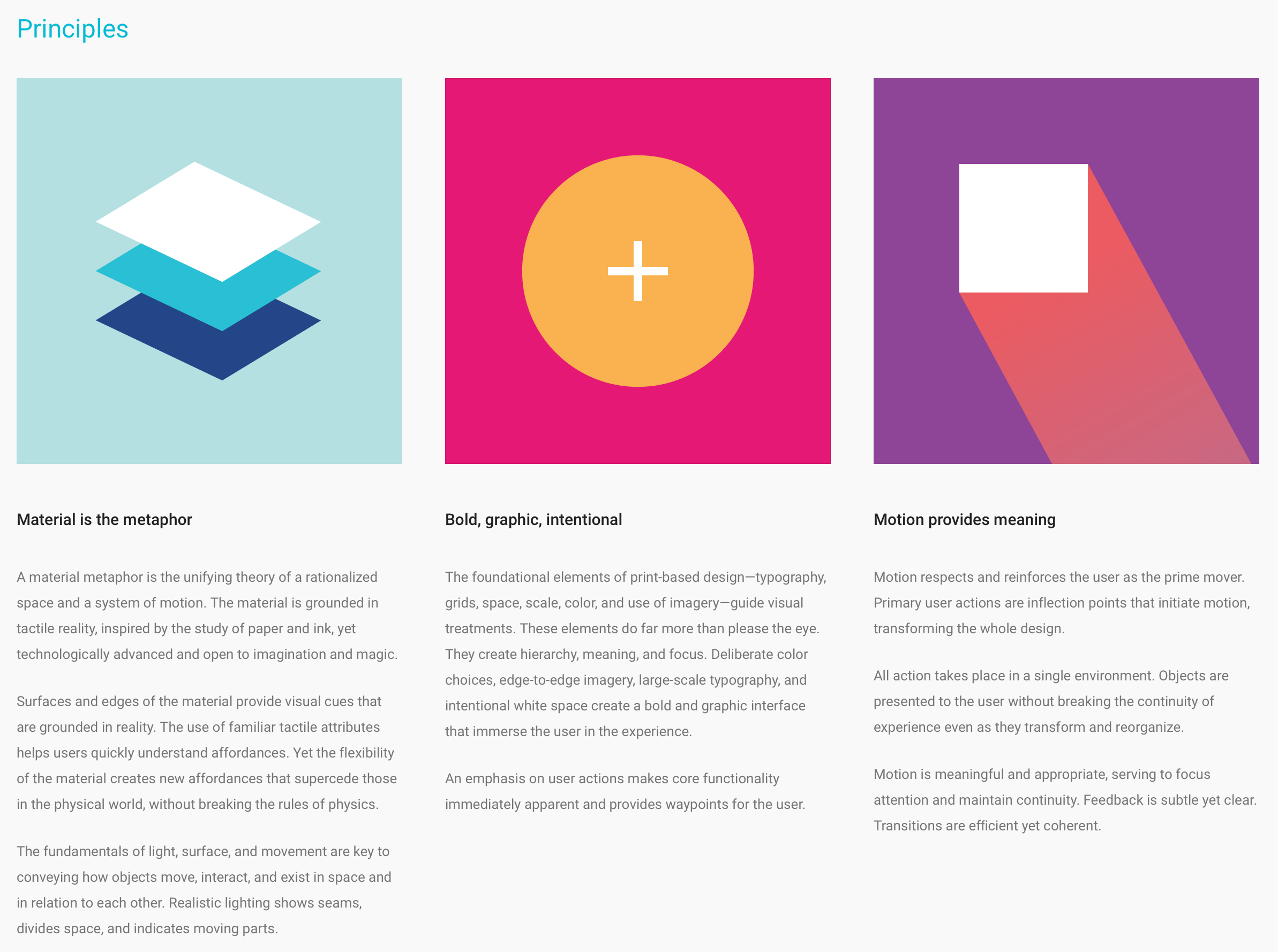
Design language style guides can (and usually do) incorporate aspects of other style guide categories in order to make high-level concepts a bit more tangible.
Design language guidelines aren’t set in stone the way brand guidelines are. For example, one day Google will likely develop a new design language to replace material design, so while Google’s overall brand will remain intact, the design vocabulary around its products will change.
Voice and tone
People interact with brands across a huge array of channels and media. In addition to the digital media we’ve discussed so far, brands also operate in print, retail, outdoor, radio, TV, and other channels. When a brand must communicate across so many varied touchpoints, speaking in a unified, consistent manner becomes critical to a brand’s success.
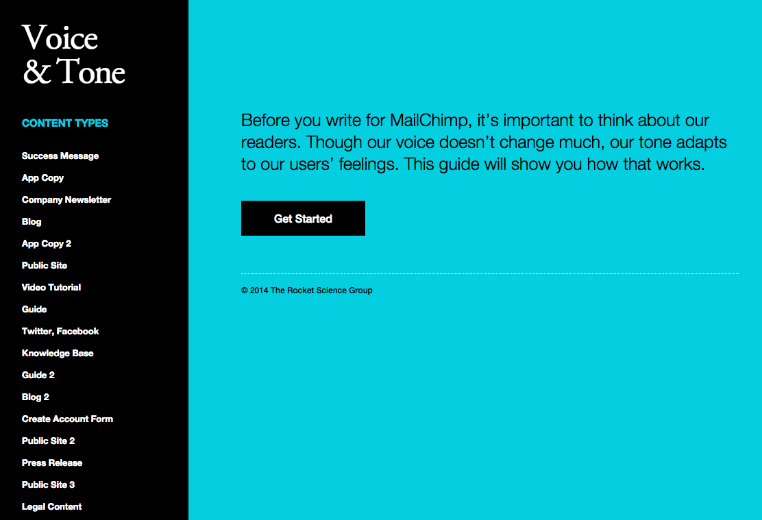
A brand’s voice stays the same from day to day, but its tone has to change all the time, depending on both the situation and the reader’s feelings. Kate Kiefer Lee
Voice is an elemental aspect of a brand’s identity, so typically brand identity guidelines include some reference to the brand’s voice. However, these guidelines usually aren’t very nuanced, which is why voice and tone guidelines are so important.
Voice and tone guidelines get into the weeds by articulating how the company’s voice and tone should shift across a variety of scenarios. MailChimp’s brilliant voice and tone guidelines define how the brand’s tone changes across content types, so that when a user’s credit card is declined, writers know to shift away from their generally cheeky and playful tone of voice and adopt a more serious tone instead.
Writing
The rise of the web and content-managed websites makes it easier than ever for many people within an organization to publish content. This, of course, can be a double-edged sword, as maintaining a consistent writing style for an organization with many voices can be challenging. Writing style guides provide every author some guidelines and guardrails for contributing content.

Writing style guides can be extremely granular, defining particulars around punctuation and grammar, but they don’t always have to be so detailed. Dalhousie University’s writing style guide provides a concise list of principles and best practices for content contributors to follow.
Code style guides
It’s essential for teams to write legible, scalable, maintainable code. But without a way to promote and enforce code consistency, it’s easy for things to fall apart and leave every developer to fend for themselves.
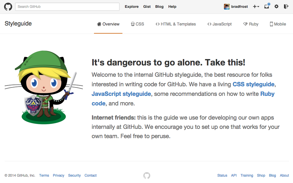
Code style guides provide conventions, patterns, and examples for how teams should approach their code. These guidelines and guardrails help rein in the madness so that teams can focus on producing great work together rather than refactoring a bunch of sloppy, inconsistent code.
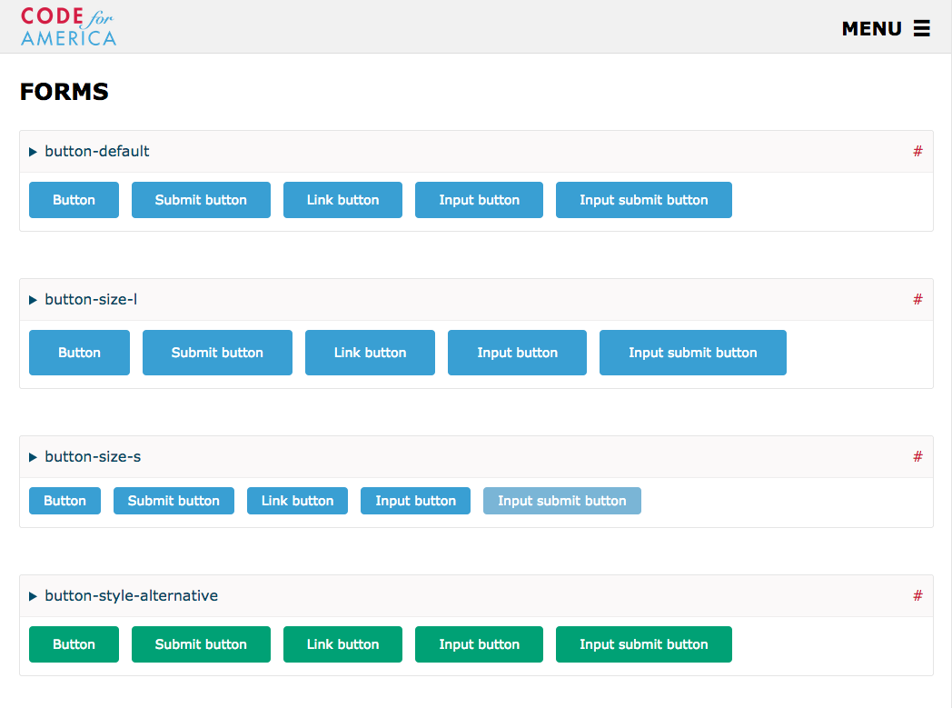
Pattern Libraries
And now for the main event. Pattern libraries, also known as front-end style guides, UI libraries, or component libraries, are quickly becoming a cornerstone of modern interface design.
The rest of this book will concentrate on how to approach interface design in a systematic manner, and detail how to establish and maintain pattern libraries.
Style guide benefits
Getting UIs to work across a myriad of screen sizes, devices, browsers, and environments is a tall order in and of itself. But once you factor in other team members, clients, stakeholders, and organizational quirks, things start looking downright intimidating.
Style guides are important tools that help prevent chaos, both from a design and development standpoint and also from an organizational perspective. Here’s why style guides are now essential tools for modern web design and development.
Consistently awesome
Web style guides promote consistency and cohesion across a user interface. This consistency benefits both the people who create these interfaces and also their users.
I recently visited my health insurance provider’s website to pay my bill. In the course of five clicks, I was hit with four distinct interface designs, some of which looked like they were last touched in 1999. This inconsistent experience put the burden on me, the user, to figure out what went where and how to interpret disparate interface elements. By the time I got to the payment form, I felt like I couldn’t trust the company to successfully and securely process my payment.
Style guides help iron out these inconsistencies by encouraging reuse of interface elements. Designers and developers can refer back to existing patterns to ensure the work they’re producing is consistent with what’s already been established.
Even third parties responsible for matching their UIs with the look and feel of a company’s internal UIs can make great use of a style guide. Externally hosted experiences like payment portals or localized sites can better match the look and feel of the primary experience by applying the styles defined in the guide.
Making style guides central to your process results in user interfaces that feel more united and trustworthy, which helps users accomplish their tasks faster and empowers them to master the interface.
A shared vocabulary
What does “utility toolbar” mean? Does everyone understand what a “touch slider hero” is?
As the number of people working on a project increases, it becomes all too easy for communication breakdowns to occur. It’s not uncommon for different disciplines to have different names for the same module, and for individuals to go rogue and invent their own naming conventions. For true collaboration to occur, it’s essential for teams to speak a common language. Style guides are there to help establish that shared vocabulary.
Style guides establish a consistent, shared vocabulary between everyone involved in a project, encouraging collaboration between disciplines and reducing communication breakdowns.
Education
In her book Front-End Style Guides, Anna Debenham deftly explains the many advantages of creating style guides, including one of the most crucial benefits: education.
Education is as important as documentation. A style guide can show clients that websites are systems rather than collections of pages. Anna Debenham
Style guides demonstrate to clients, stakeholders, and other disciplines that there’s a lot of really thoughtful work going into a website’s design and development beyond just “Hey, let’s make a new website.” A pattern library communicates the design language in a very tangible way, which helps stakeholders understand that an underlying system is determining the final interface.
Style guides can help alleviate what I call special snowflake syndrome, where certain departments in an organization think that they have unique problems and therefore demand unique solutions. By exposing the design system in the form of a style guide, these special snowflakes can better appreciate consistency and understand why their requests for custom designs receive pushback.
An empathetic workflow
Education isn’t just important for clients and stakeholders. A good style guide helps inform designers and developers of the tools they have in their toolbox, and provides rules and best practices for how to use them properly.
By making a style guide a cornerstone of your workflow (which we’ll detail in chapter 4), designers and developers are forced to think about how their decisions affect the broader design system. It becomes harder to go rogue and easier to think of the greater good. And this is exactly where you want team members to be.
A style guide provides a home for each discipline to contribute their respective considerations and concerns for patterns. By collecting all these considerations under one roof, the style guide becomes a hub for everyone involved in the project, which helps each discipline better understand the design system from many perspectives.
Testing, testing, 1-2-3
The homepage is broken, you say? Well, what exactly is breaking it?
The ability to pull an interface apart into its component pieces makes testing a lot easier. A style guide allows you to view interface patterns in isolation, allowing developers to zero in on what’s causing errors, browser inconsistencies, or performance issues.
Speed
Earlier in the chapter we discussed how faster design and development is one of the main reasons why UI frameworks like Bootstrap are so popular. We’re under pressure to get projects out the door as soon as humanly possible. By developing your own design system, you can reap those same speed rewards as the out-of-the-box UI tool kits.
It’s true that devising an interface design system and creating a custom pattern library initially takes a lot of time, thought, and effort. But once the pattern library is established, subsequent design and development becomes much faster, which tends to make everybody happy.
Federico Holgado, lead UX developer at MailChimp, explained how MailChimp’s pattern library initially consisted of patterns created from the four primary screens of their app. But once they moved on to other areas of the site, they realized they were able to use existing patterns rather than having to generate brand new patterns from scratch every time.
…Once we did that, as we were implementing things in other pages we started to realize: man, this system will actually work here and this system will actually work here and here. Federico Holgado
In it for the long haul
There’s no doubt style guides help teams effectively get things done in the here and now. But much like a fine wine, style guides increase in value over time. The beautiful thing about interface design systems is that they can and should be modified, extended, and refined for years to come.
As previously mentioned, creating a custom pattern library requires a lot of hard work up front, but that hard work should provide a structural foundation for future iteration and refinement. Lessons learned from analytics, user testing, A/B testing, and experience should be incorporated into the style guide, making it a powerful hub for truth, knowledge, and best practices.
Better yet, even if you were to undertake a major redesign you’ll find that many of the structural interface building blocks will remain the same. You’ll still have forms, buttons, headings, other common interface patterns, so there’s no need to throw the baby out with the bath water. A style guide provides a rock-solid foundation for all future work, even if that future work may look totally different.
Style guide challenges
By now the benefits of creating design systems should be abundantly clear, and hopefully visions of sugar plums and beautiful style guides are dancing through your head. But to reach style guide nirvana, you must first overcome the many treacherous challenges that come with the territory.
The hard sell
To benefit from style guides, organizations must first appropriate the necessary time and budget to make them happen. That requires organizations to overcome the short-term mentality that all too often creeps its way into company culture.
The long-term benefits that style guides provide are obvious to those who are already thinking about the long game. The challenge, therefore, becomes convincing those stuck in a short-term, quarter-by-quarter mindset that establishing a thoughtful design system is a smart investment in the future.
A matter of time
The hard part is building the machine that builds the product.” Dennis Crowley
Perhaps the biggest, most unavoidable challenge is that style guides are time-consuming to create. I don’t know about you, but I don’t go into work every day twiddling my thumbs wondering what to do with my time. I’ve never met a person who isn’t feeling pressure to get work out the door, and this pressure naturally leads to focusing on the primary web project. Unfortunately, aggressive timelines and finite budgets detract from the effort required to make style guides happen, even when teams are committed to the cause.
Auxiliary Projects
Pattern libraries are often treated as auxiliary projects, rather than as the component parts of the final product. By treating pattern libraries as something separate from the core project, they tend to fall into the nice to have category and become first on the chopping block when the going gets tough.
This auxiliary project conundrum reminds me of sentiments I often hear around factoring accessibility into projects. They say, “Oh, we wish we had the time and budget for accessibility, but…” The notion that accessibility (and other principles like performance and responsiveness) is a costly extra line item is a fallacy. Pattern libraries, like accessibility, are good ideas to bake into your workflow whether or not the project plan explicitly calls for them.
Maintenance and governance
Even if time and money are allocated to establish style guides, these valuable tools often die on the vine if they’re not given the focus they need to reach their true potential.
A maintenance and governance strategy is critical to style guides’ success. Style guides will be thrown in the trash (right beside all those PSDs and wireframes) and abandoned without a proper strategy in place for who will manage, maintain, and enforce them.
Style guide maintenance is a hugely important topic and deserves to be covered in detail, so we’ll dive into how to create maintainable style guides in chapter 5.
Audience confusion
Style guides can be misunderstood as tools useful only to designers or developers, which leads to a lack of visibility that immediately limits their effectiveness. Instead of serving as a watering hole for everyone in the organization, a style guide can become a best-kept secret guarded by one discipline. Color me naive, but I don’t think this helps foster a culture of collaboration.
Without thinking of broader audiences, style guides may come across as too vague or too technical, which can intimidate other disciplines and lead them to believe these resources aren’t for them.
Style guide structure
For style guides to be useful resources for everyone in an organization, they should clearly convey what they are and why they matter. Style guides should be attractive, inviting, visible, clear, and easy to use. As mentioned above, they should be aware that a whole host of audiences will be viewing them, so should therefore aim to be welcoming and useful for as many people as possible.
Lack of context
Context is key to understanding a design system. Unfortunately, most pattern libraries out in the wild don’t provide any hints as to when, how, and where their components get used. Without providing context, designers and developers don’t know how global a particular pattern is, and as a result wouldn’t know which pages of their app would need to be revisited, QA’d, and tested if changes were made.
Lacking a clear methodology
As much as I adore the pattern libraries out there, I can’t help but notice a lack of structure in many of them. Don’t get me wrong, I think it’s absolutely fantastic that teams are thinking systematically and are documenting their UI patterns. But I often feel like many pattern libraries are little more than loosely arranged sprays of modules. I think there’s room for improvement.
In search of an interface design methodology
For us to create experiences for this eclectic web landscape, we must evolve beyond the page metaphor that’s been with us since the birth of the web. Thankfully, organizations are embracing modularity across every aspect of the web creation process, which is leading to smarter work and more sustainable systems.
As the number of devices, browsers, and environments continues to increase at a staggering rate, the need to create thoughtful, deliberate interface design systems is becoming more apparent than ever.
Enter atomic design.